Template Content & Styles
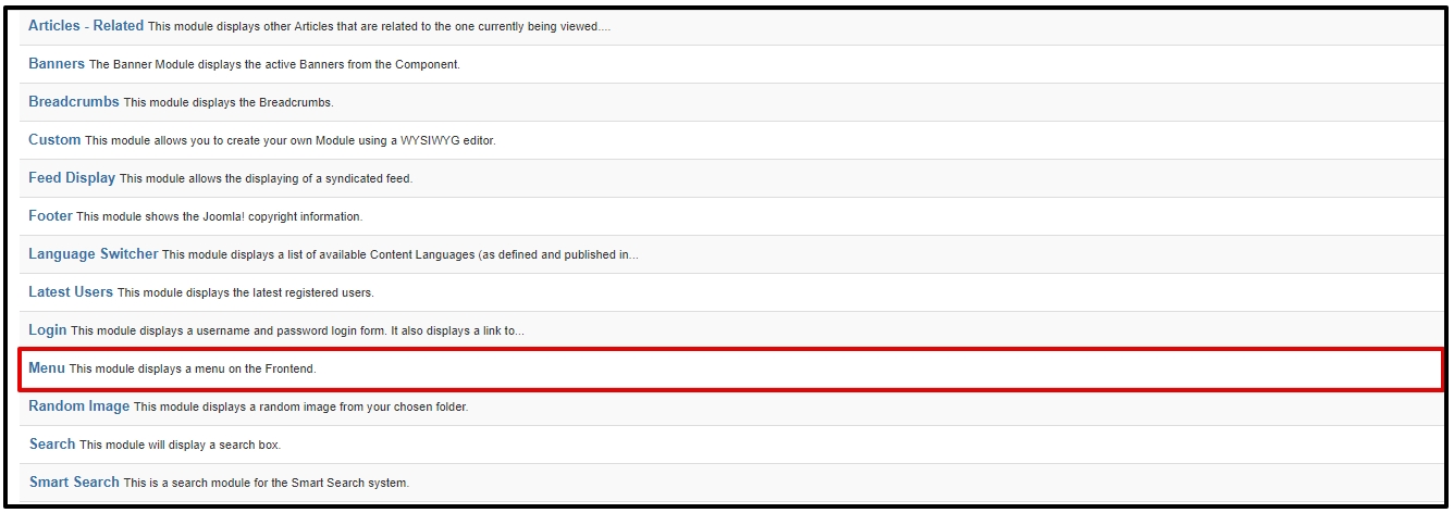
How to Display Main Menu
Open a new browser window and type in the URL, which will be similar to http://www.your-site-name-here.com/administrator or, if you have Joomla! installed on your local computer, http://localhost/your-folder-name-here/administrator. Here you will have to log in as an Administrator or Super Administrator.
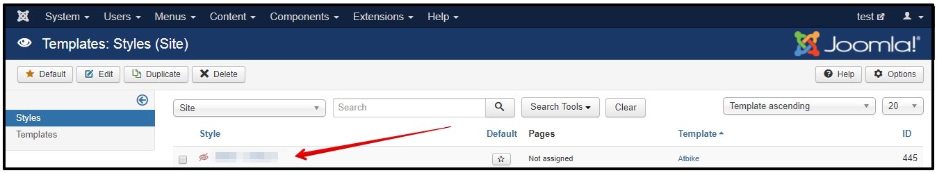
Go to “Extensions” / “Templates” / “Styles” / “[template_name]-default”. This is where you edit template styles.
Here, click Template Options.
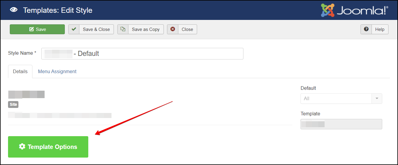
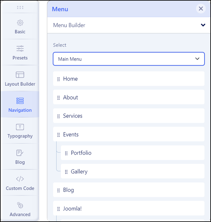
Click on the Navigation tab, then under Menu Builder, select Main Menu.
Click Save at the top right to save your changes. To exit without saving, click on either X button.
How to display the off-canvas sidebar?
Publish a module on the “off-canvas” module position. It is a built-in Joomla module position in the off-canvas sidebar.
Go to Extensions -> Modules -> New and choose the module type you want to display in the off-canvas sidebar. Type “offcanvas” as the module position name:
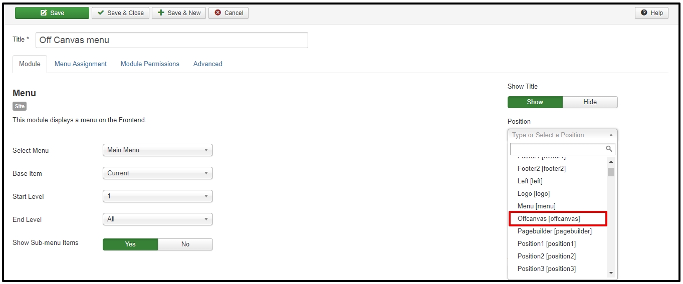
Click the Save or the Save & Close toolbar button to save the Module Off-Canvas Menu. To leave without saving click the Cancel toolbar button.
Add Menu Items to Your Menu
To Create a New Menu Item:
- Select Menus → [name of the menu] → Add New Menu Item from the drop-down menu on the back-end of your Joomla! installation. For example, if a Menu is called “About Joomla”, select Menus → About Joomla → Add New Menu Item.
To Edit a Menu Item:
- Select Menus → [name of the menu] from the drop-down menu on the back-end of your Joomla! installation. For example, if a Menu is called “Main Menu”, select Menus → Main Menu. Then either click the title of the menu item in the table list or select the menu item checkbox and click the “Edit” icon in the toolbar.
How to Add a New Menu
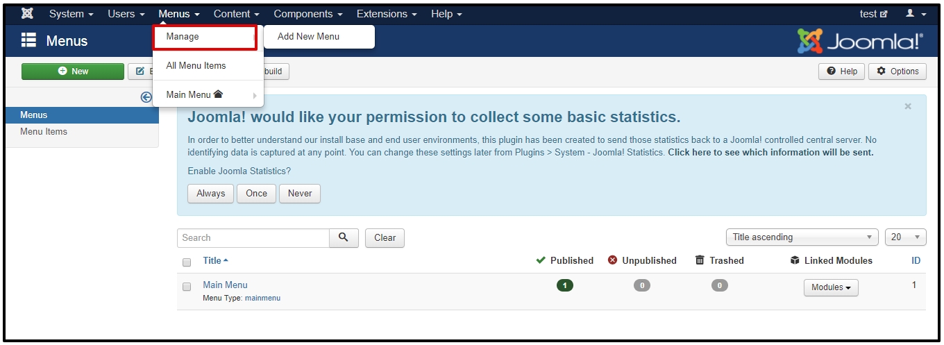
There are 2 ways to add a Menu: Within the site administration panel, select Menus from the menu bar in the upper left corner. From the drop-down list, choose “Manage” then choose “Add New Menu”. You can also select a Menu Manager from the left column and then select “New” from the top left corner icons.
3. Fill in the “Title”, “Menu Type” and a “Description”:
- Title *: A proper title for the menu. This is used to identify the menu in the Menu Manager in the backend.
- Menu type *: This should be a unique identification name used by Joomla! to identify this menu. Spaces are not allowed but you may use the ‘-‘ character such as news-menu.
- Description: A description of the menu, useful for your own reference.
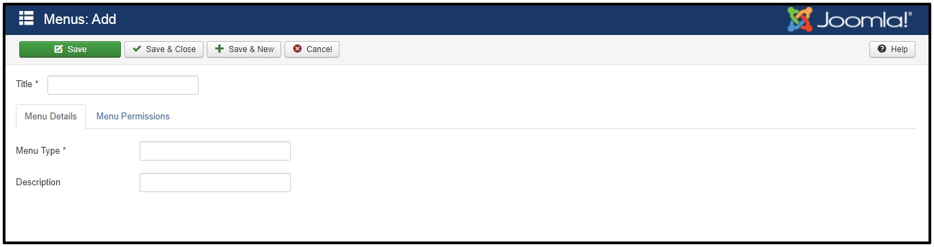
Click the Save or the Save & Close toolbar button to create the new menu. The Save & Close button will return you to the Menu Manager. To leave without saving click the Cancel toolbar button.
4. If you saved and closed, you will see your new menu in the list of Menus.
Bottom, Footer, and other modules
– How to Access?
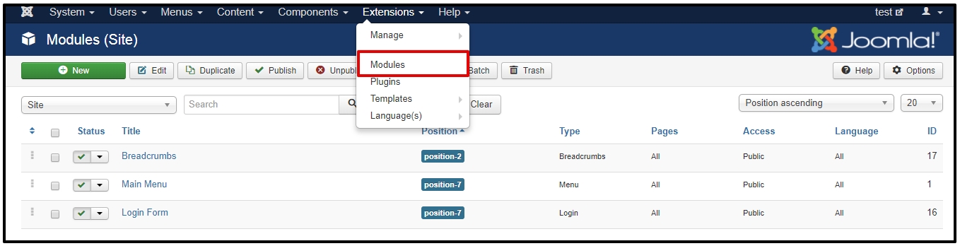
From the main menu select “Extensions” / “Module”
– After that, click on the ‘New’ button in the toolbar to create a new Module Item, or select a Module by double-clicking the Module’s Title or check the ‘check box’ and click on the ‘Edit’ button.
– You will now see a screen with a list of all of the modules on your website.
– How to edit existing modules?
Bottom modules place at position ‘bottom1’, ‘bottom2’, ‘bottom3’ and ‘bottom4’, you can find it via Module Manager with ‘Select Position’.
Footer modules based on position ‘footer1’ and ‘footer2’ as well.
– How to Create New?
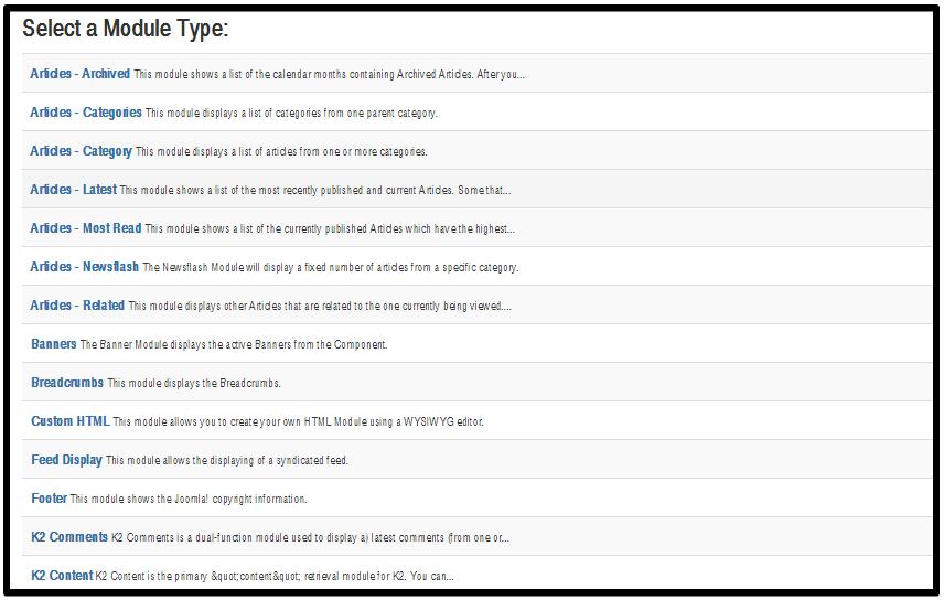
When creating a new Module, you will be presented with a modal popup window. Choose the module type by clicking on the module name to be taken to the ‘edit’ details screen.
– How to Edit Modules?
From this screen you can search module by Filter: Site or Administrator; Select Status, Select Position, Select Type, Select Access and Select Language. And you can edit existing modules, publish/ unpublish modules, and even delete modules should you need to.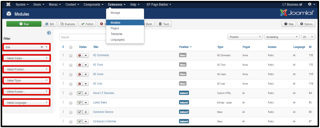
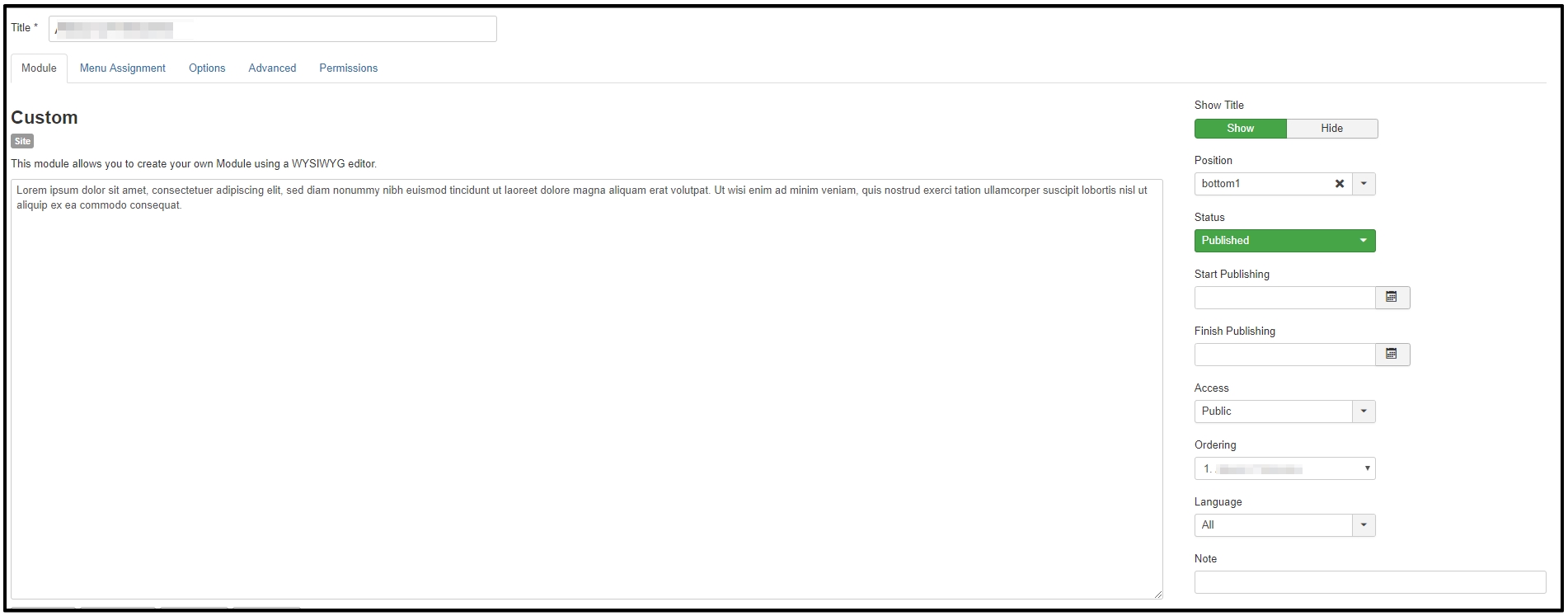
MODULE TAB
1. Title: The Title for this item. This may or may not display on the page, depending on the parameter values you choose.
2. Custom HTML: This module allows you to create your own HTML Module using a WYSIWYG editor.
3. Position: Click button for drop down window to select Module position by available positions in a Template(s) installed.
4. Status: The published status of this item.
- Published: Item is visible in the front end of the site.
- Unpublished: Item will not be visible to guests in the front end of the site. It may be visible to logged in users who have edit state permission for the item.
- Archived: Item will no longer show on blog or list menu items.
- Trashed: Item is deleted from the site but still stored in the database. It can be permanently deleted from the database with the Empty Trash function in Article Manager.
5. Start Publishing: Date and time to start publishing. Use this field if you want to enter content ahead of time and then have it published automatically at a future time.
6. Finish Publishing: Date and time to finish publishing. Use this field if you want to have content automatically changed to Unpublished state at a future time (for example, when it is no longer applicable).
7. Access: Select the viewing access level for this item from the list box. The access levels will depend on the what has been set up for this site to display.
8. Language: Select the language for this item. If you are not using the multi-language feature of Joomla, keep the default of ‘All’.
9. Note: Item note. This is normally for the site administrator’s use (for example, to document information about this item) and does not show in the front end of the site.
MENU ASSIGNMENT TAB
– Module Assignment: Click for drop down choice of module assignment.
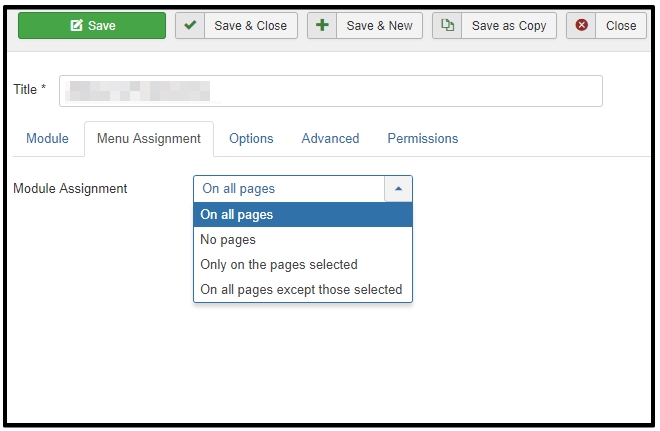 – All pages: Module will show on all pages in the selected module position.
– No pages: Module will not show on any pages in the selected module position.
– Only on pages selected. Module will show only on pages in the selected module position as selected by menu item type(title).
– On all pages except those selected: Module will show on all pages in the selected module position, except those selected by menu item type(title).
OPTIONS TAB
Additional Options, such as Basic and Advanced can be found on the specific Module Type Help screen. Please notice that installed Extensions may contain more parameters in Additional Options. Please refer to the specific Extension Module’s information provided by the Extension developer.
How to replace Map Address in Contact page
Yes, most of Joomla! Templates provide a Contact page with Google Map, you can replace it by following steps:
- Disable Editor via Admin > Global Configuration, find the option “Editor” and disable it.
- Go to Map.Google.com, fill in your address and get your business location, then embed the Iframe code and copy it.
- Go to Admin > Module Manager, find a module named Map, then you can replace Map iframe embed code with your new code.
- After finish, you can check your map display and re-enable Editor.
Third-party extension to build template content
Building content with SP Page Builder
a) Edit content in Homepage: all content in ‘Home’ page based on SP Page Builder Free (see part “3-Party Build-in Document” to know more about this extension), so you can edit it via Admin > SP Page Builder, edit ‘Home’ page. This is very easy to edit based on drag-drop content with this extension.
b) Edit content in menu item “Pages”: all subpages in this menu items also based on SP Page Builder content, so you can edit it via SP Page Builder like “Home” page, go to Admin > SP Page Builder, select page that you want to edit and click to edit.
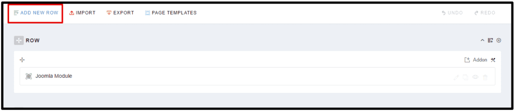
+ First step, is always this same, use ADD NEW ROW to create a new row.
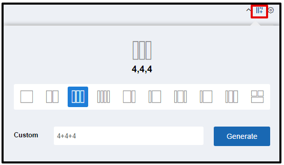
+ Second step, use  allows you to divide current row into columns.
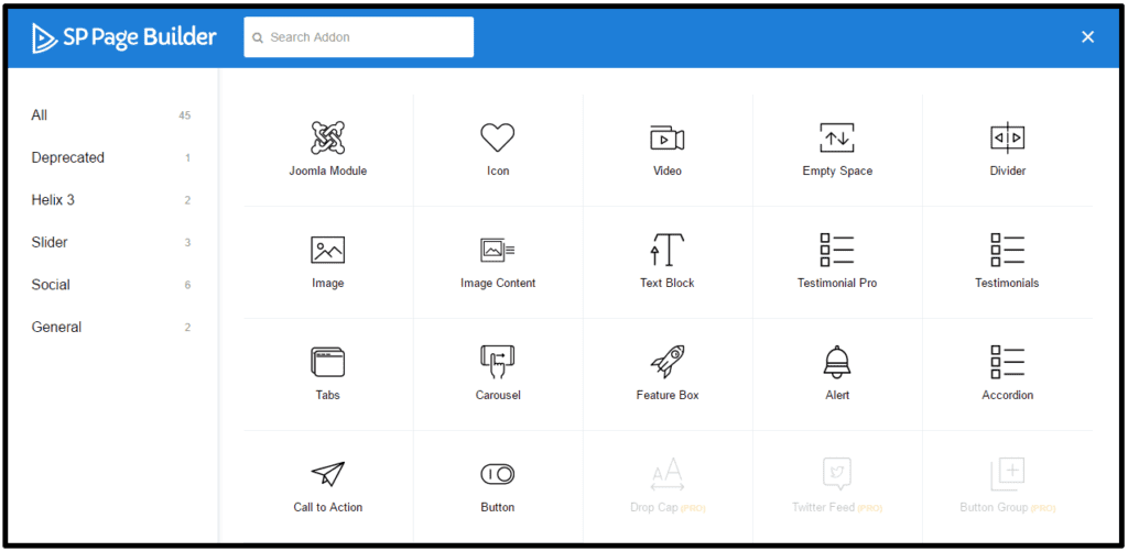
+ Third step, insert one addon inside block from a long available list (number of addon depends on the version of SP Page Builder)
+ Finally Step, each column have its own options which allow you to set a few typical appearance settings:
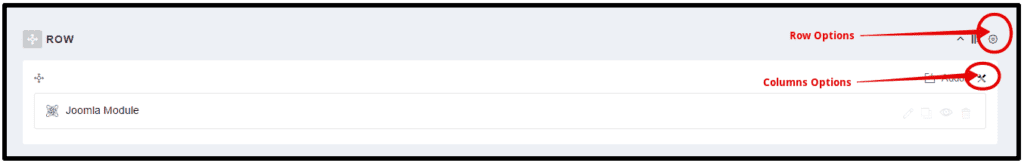
– Row Options
A few typical appearance settings:
(1) Section Title: Insert a title which will display as a section title. Leave blank if the section does not require any title.
(2) Heading: Select Title Heading from the list.
(3 and 4)Title Font Size & Title Font Weight: Set font size & weight for this selector( e.g. 25px & bold).
(5) Title Color: Title Text Color.
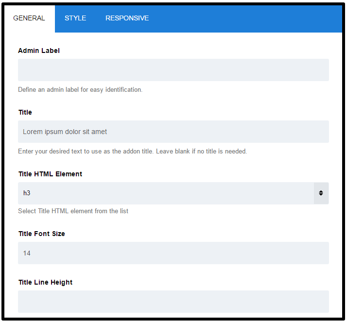
(6) Title Margin Top: Set an optimum distance from the Top element.
(7) Title Margin Bottom: Set an optimum distance from the Bottom element.
(8) Section subtitle: Insert a section subtitle which will display as a section subtitle (description). Leave blank if section does not require any subtitle.
(9) Title & Subtitle Position: Set position for both Title & Subtitle element.
(10) Background Color: Set the background color of an element. Use a background color and a text color that makes the text easy to read (contrast).
(11) Background Image: Set background images for an element. Always set a background-color to be used if the image is unavailable.
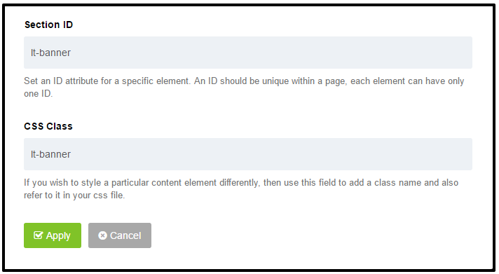
(12) Section ID: Set the ID attribute for the specific element. An ID should be unique within a page, each element can have only one ID.
(13) CSS Class: If you want to style a particular content element, then use this field to add a class name and then refer to it in your css file.
– Column Options
A few typical appearance settings:
(1) Background Color: Choose background color, by default it’s transparent. Use a background color and a text/font color that makes the text easy to read (contrast).
(2) Column Padding: allows you to change paddings for chosen column, default values are equal: 10px 10px 10px 10px (Top Right Bottom Left).
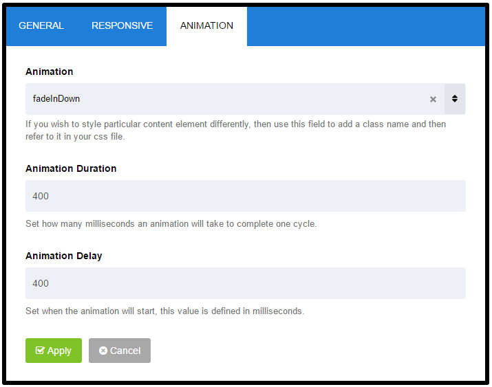
(3) Column Animation: this option provides several effects of animation for a column. These include simple, standard animations that are frequently used.
(4) Animation Duration: set how many milliseconds an animation takes to complete one cycle, it means how long the animation will run. Durations are given in milliseconds; higher values indicate slower animations, not faster ones.
(5) CSS Class: if you want to add custom style for a particular content element, then use this field to add a class name and then refer to it in your css file.
Manage portfolio feature with SP Simple Portfolio
SP Simple Portfolio extension is a free Joomla! 3.x component designed to create interactive portfolio functionality with category filtration into your website. Easy Portfolio contains also a module, which can be used in any place on the current layout.

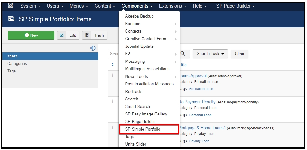
– How to add new items?
From the main menu select “Components” / “SP Simple Portfolio” / “Items”
– You will now see a screen with a list of all of the portfolio items on your website. From this screen you can add new items; edit any existing items, publish/ un-publish items, and even delete items should you need to.
– You have to start by adding new tags in the component, without them you won’t be able to add new items. Add at least one new Tag. The same tag can be applied to many different items across the portfolio.
Each new tag has its own name and alias. If you add one or more tags you can start to add new items.
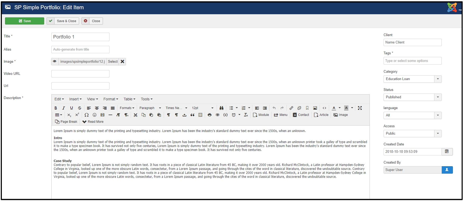
You have to fill all fields marked with *: title, image, description, and tags.
(1) Alias – Alias is used in creating the URL (website address) for the detail page. By default, component will use the Title for creating the alias (with modifications) unless you type an Alias in yourself. Joomla will make the alias all lower case, replace spaces with dashes and take out any characters that can not be accepted.
(2) Image – About choosing an image for an item, you can use those which you have or upload a new one. We recommended image size : 1170px X 800px, but of course, if you have only smaller you can also use them.
(3) Video URL – Portfolio items can contain not only images but also YouTube or Vimeo video clips. Just insert your video URL. Leave this field blank if the video is not required.
(4) Description – in this field you can add descriptions or even additional images which will be displayed on the item detail page under main image.
(5) Tags – All items are based on the Tags system, which are similar to categories. Once you get to three letters you will start to see suggested tags that already exist. The advantage of this solution is that each item can be assigned to multiple tags. Also, the same tag can be applied to many different content items across the portfolio. Tags will be used to filter portfolio items.
(6) URL – Each item can include its own link. Leave this blank if you do not want to show the project URL.
(7) Status – Whether this item is published or not.
(8) Language – Items include a basic way to implement a multi-language site. All items may be associated with different languages.
Manage Blog with K2 Extension
Once you are up and running with your own Joomla website, and feel ready to start blogging (or creating content as it is now fashionably called), follow these rules to get the most out of your website, boost your website visits from search engines, and avoid making the common K2 mistakes.
Step 1 – Log in to your Joomla Admin Panel. You can usually access this by inserting the URL www.mysite.com/administrator/ into your web browser (make sure you substitute your actual domain in for mysite.com)
Step 2 – From the main menu, select “components” / “K2” / “items” (“items” is just the confusing K2 term for what is otherwise known as a blog, article or webpage). Note – please leave all other options in the K2 menu untouched unless you have web development knowledge or have been told otherwise by your web agency.
– You will now see a screen with a list of all of the blog items on your website. From this screen you can add new items; edit any existing items, publish/ un-publish items, and even delete items should you need to.
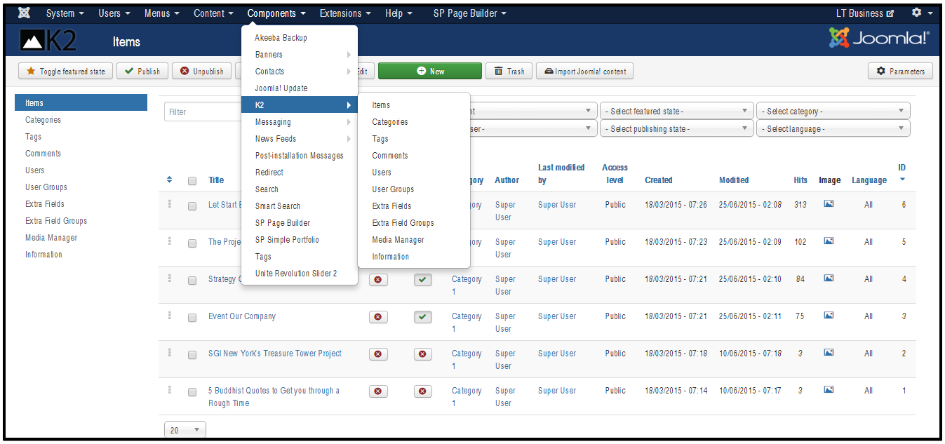
Step 3 – For the purpose of this tutorial, we will create a new item (blog) – so click on the “New” button.
– Now you can write your K2 item and make any edits using the detailed instructions below.
* The compulsory fields in a K2 blog
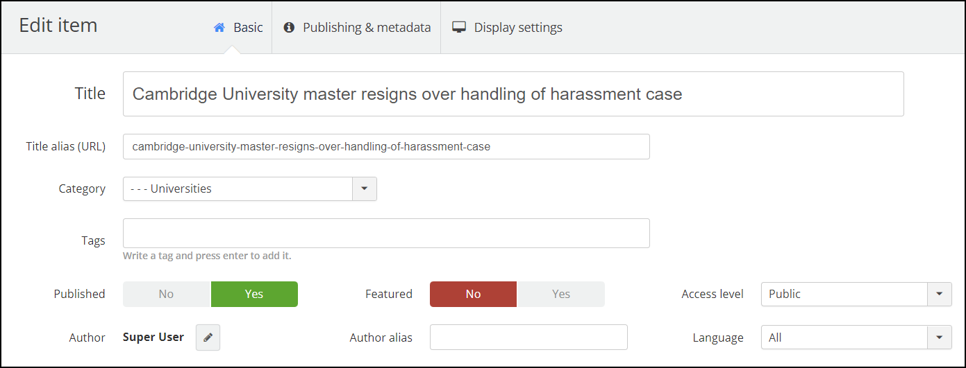
1. Title: Add a Title that clearly describes what your blog item is about. If you want to optimize your new blog for search, then your chosen keyword/ keyphrase should be included in the Title.
2. Title Alias (URL): When you first save your item, the Title alias (URL) will auto-complete based on the Title you created, so you don’t actually need to touch this field. Here are a few simple and very important rules to follow when creating a Title alias (URL):
- The Title alias (URL) will be the link to your new blog page. Once your blog goes live, the Title alias (URL) should NEVER be changed, otherwise, you will lose your social shares, backlinks from other websites to your article plus any potency that the page has achieved in search engines rankings such as Google.
- The page URL (or link) should be descriptive, pertinent to the k2 article and human-readable (ie. without funny characters and symbols). If you have any doubts at all, just make sure that the URL is identical to your item Title.
3. Category: When creating your website, your webmaster will have set up a selection of K2 Categories. The Category is an extremely powerful field that dictates in which section of your website the blog item will show up. Changing the Category field will move the item to a different section of the website.
In general, once a blog is live you will never want to change the Category as it could upset your page links. If your item has been published for more than a few days, always check with your web agency before changing the Category field.
4. Published: Publish is a straight-forward yes/no field that will publish or un-publish your K2 blog item. If you want to remove an item from your website simply set this field to No. You can revert back to “published” whenever you want.
5. Content: The content tab is where you write the text for your new page.
We are now in the world of Web 3.0 and the Semantic web. Realistically if you want your K2 blog item to rank well on Google, then we advise a minimum of 1000 words, and ideally around 2000 word of high quality, informative copy. Simply put, if there are better pages out there on the web covering the same subject, then you will struggle rank well and get new visitors from Google (which is usually the main writing a blog).
– A word of warning about using the Text Editor:
- Keep use of the Text Editor buttons to an absolute minimum.
- Applying bold, underline, italics and headers to the article is time-consuming and your site will not be unique.
- Any good web designer will have built your website using a central graphic override file called a .css or .less file. From here they will be able to control the look of your entire website in a few seconds – rather than you going through every single page to make a graphics change.
- Controlling the graphics from the central graphic override file will ensure that your website has a consistent professional look throughout.
- Although you cannot see it, text editors often adding lots of unnecessary code to your page, making your website slower to load, and harder for Google to rank.
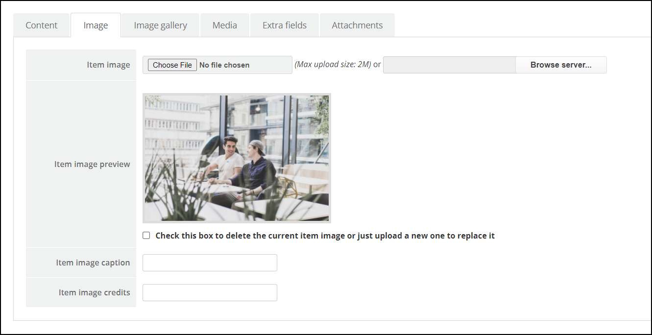
- Use the image button (found directly below the Text Editor) to add images into your K2 blog item. First of all, click within the item text exactly where you want the image to appear, hit the “Image button”, and a pop-up window will appear.
6. The Image tab: technically, although it is not compulsory, adding an image to each blog item is a wise idea. It is the truth that, although we shouldn’t judge a book by its cover, we somehow all do! Choosing a striking image that reflects your blog will work wonders for your article especially on social networks. Looking for free images? Try these free stock image websites. You have the option to either select the image directly from your server or upload from your computer.
7. Meta Description: Open the Meta information tab and click on the Description field. The Description is what will show up in Google search listings.
Use your Description to elaborate on your page title and give your potential viewers a better idea of what will be on the page when they click. A typical search results page has 10 website listings, so a well-written Description will ensure your website stands out and will improve your click-through-rate. Try and describe exactly what your page is about using superlative terms and even the odd UPPERCASE word to give your page a competitive advantage.
Google shows 150 – 160 characters (including spaces) of a page’s description (aka meta description tag). If your Description exceeds 160 characters, it will be truncated.
Once everything is finished, make sure you click “Save and close“. Otherwise, the item will remain locked and other website administrators will be unable to access.
This is basic set up for K2 Extension, for more details about how to use K2, please go to See how to use K2 Extension
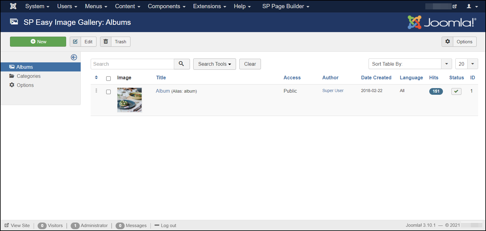
Manage Image Gallery with SP Easy Image Gallery
SP Easy Image Gallery is a very simple but hugely effective Joomla extension for stunning image gallery display on your website. Its in-house amazing features and lightweight nature of the component will give a quick head start while designing albums of your website.
Dedicated album creation, image adding and a whole lot of other systems of SP Easy Image Gallery will give you a glitch-free experience of beautiful image display. SP Easy Image Gallery serves you with lots of in-house options like customization of thumbnails, Gutter and column management, and many more exciting gears.
Create a category
You can add categorized album listings by adding different categories of images and list them in a categorized way for the friendliness of showcasing. To do that simply click the categories from the left menu. Then click new to add a new category. A new window will pop up.
Give your category a title. Also, you can add a description of your category. If you are finished with all the customization set the status to “Published” and it’s ready to go.
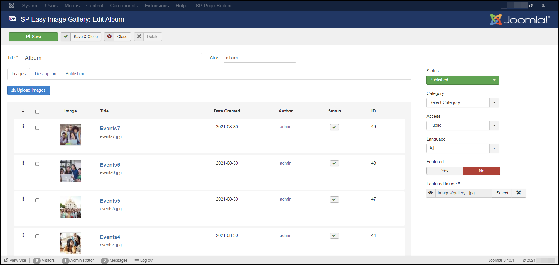
Create Albums
To create a new album with SP Easy Image Gallery, just click new on the top of the album page. A new window will pop up and there you need to add detailed customization of the album. On this page give your album a title in the title text-box on top of the page. Then you can add a description of the album. The most important part here is that you have to add a featured image of the album. Add the thumbnail image which will be the feature image of your album. After you finished doing all the customization set the album status to published. Before that, you can and should select a category from the list of categories you have created.
Image Edit
You can do some minor customization of the images you have added. Just click the edit button, you will find that on the bottom of every image. You can add title and caption in this popped window.
Manage Slider Functions with Unite Slider
Unite Slider is an amazing layered slider for Joomla! websites. You can easily design your sliders with no CSS or jQuery knowledge required to create awesome animated effects.
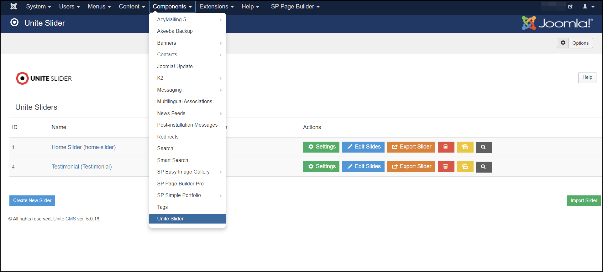
- From the admin panel, navigate to Components > Unite Slider.
- You will now see a screen with a list of sliders on your website. Here, you can add new sliders, edit existing sliders and even delete sliders should you need to.
Slider Settings
Once you Created a Slider, you can open the Slider Settings (Settings) any time to manage any general settings per Slider.
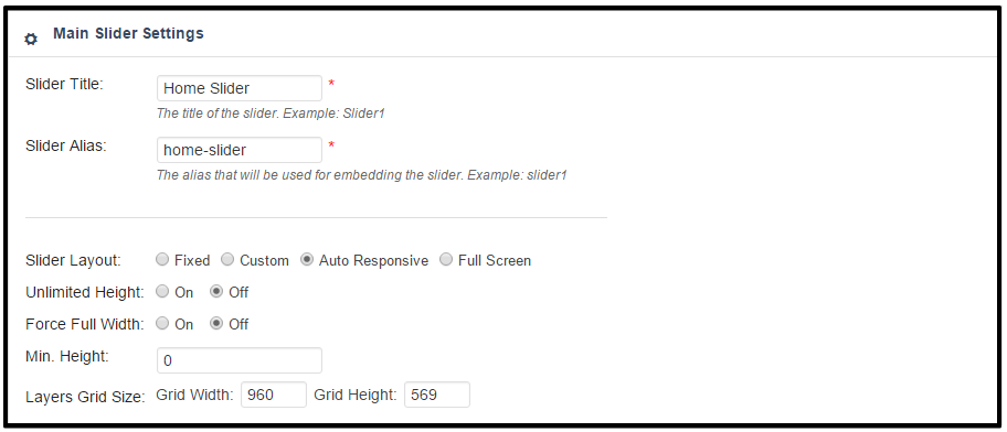
(1) Slider Title: A Internal used Name for the Slider. Only for Backend Usage.
(2) Slider Alias: An individual name of the slider. Don’t use Speical chars and spaces here. This will be used for ShortCode embedding and for any other art for embedding and corresponding/link internal to the slider.
(3) Slider Layouts
- Fixed: A None Responsive Version of the Slider. Will have a prepared Width and height. Used for Older Themes
- Custom (it has been called “Responsive” in Earlier version): A Custom Grid system to set size of Slider per Browser Size. You can define different Levels for sizes. Only used for Frameworks where no Fluid Widths has been used. (i.e. Skeleton)
- AutoResponsive (it has been called “Fullwidth” in earlier versions): Used for Fluid Responsive themes, where the Slider calculates its own size for every Browser size. Only max width hand height of Grid should be defined. In case the Container Width is not Boxed, it will go Fullwidth Automatically
- FullScreen: Slider will take the height of Window and center the preset Grid within. It will always try to go FullHeight and Fullwidth if the wrapping container allows.
(4) Layers Grid Size:
– Depending on the Layout you can set the Width and Height of the Captions. The Slider will go Fullwdith or Fullwidth and Fullheight in case you set AutoResponsive or FullScreen. Caption Grid will be centered always within the slider container.
– In some cases (Custom) you can set multiple Levels depending on Screen Size. This is not needed in AutoResponsive and FullScreen mode.
– The fullscreen mode allows you to set a Container (per class or ID) which heights decrease the height of the FullScreen Slider Container automatically in every responsive level.
Edit Sliders
Navigate between the Slides simple selecting The Tabs on the top. Don’t forget to Update the Slide before you leave one tab!
Each Slide has its own General Setting. You can set transitions, Local delays, thumbnails etc.
(1) Slide Title: Used only Internal Naming of the slides
(2) State: Published / Unpublished – used for Editing, modification the slide. If it is Unpublished, front-end won’t show this slide at all.
(3) Visible From/Until: If set, the Slide will only be visible between the set times. If Visible Until is not set, the Slide will be visible as soon as the Visible From date is reached. If Visible From is not set, the Slide will be visible until the Visible Until date is reached.
(4) Transitions: The Animation Style how the Slide appearance. You can select more than one from a multiple choice drop-down list. Every new loop will use another Transition if you selected more then one.
(5) The Image Source for the Main Image: A Slide can have an Image, Transparent Image, Solid Color or External Image as Main Image. This Image is the “Main Layer” in the background which has been animated via the General Settings predefined Transitions parameter.
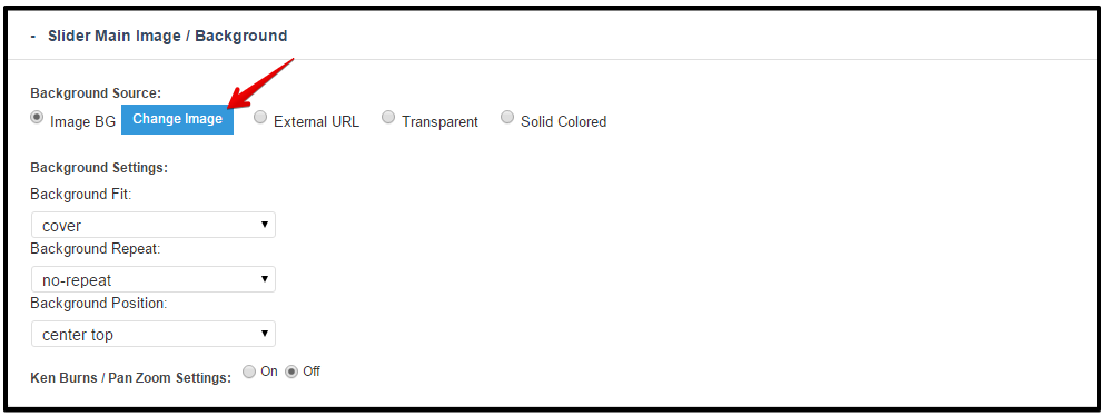
(6) Background Fit/Repeat/Position: With these options, the chosen background image can be adjusted.
You can choose from following layers/captions: HTML Markups, Image, Video.
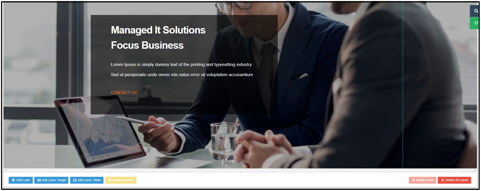
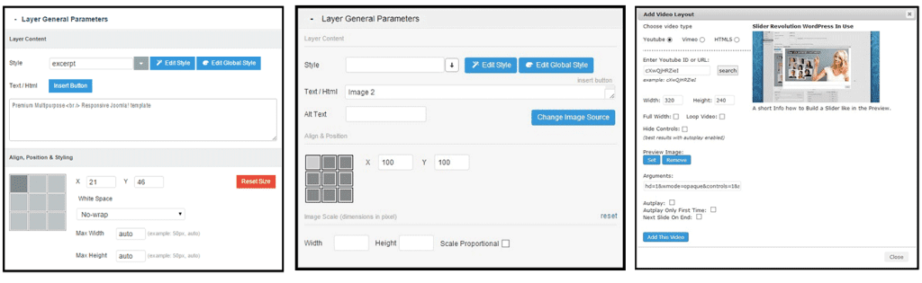
(7) Text Layer, Image Layer and Video Layer: For individual TEXT / HTML Markup Layer, Image Layer and Video Layer click on Add Layer and follow the following settings
– Style / Edit CSS
– To define a predefined Style or add your own Style use the Style Drop Down list. You can change the Styling of the captions / Layers via the Embedded CSS Editor (Edit Style).
– Use HTML5 Standard markups in case you wish to embed paragraphs, headings, buttons etc.
– The Captions have the white-space: nowrap setting default. It is important because of the transitions. Please use <br> for line breaking, or add different layers for multiple lines.
– For further styling that is not possible through Edit Style, use the Edit Global Styles and put your Styles there.
– Align & Positions
– Set the Align of the Layers / Captions. Left Top is default. Drag and Drop move of the Layer will be based on the Align. If you set the Align to Center Center, the Drag And drop will be based on this aligned position and use an Offset.
– i.e. Center Center Offset X -21px Offset Y -46px will be used in every responsive size linear calculated. If the Screen size is scaled to 50% than the Item is still in the middle of the grid and offset is -50px -50px (linear calculated).
– Center Center snaps the Center Center of the Layer to the Center Center position of the Gird. Right Bottom snaps the Right bottom corner of the Layer to the Right Bottom corner of the Grid etc.
This is basic set up for Unite Revolution Slider 2 Extension, for more details about how to use Unite Revolution Slider 2, please go to See How to use Unite Revolution Slider 2
Template Settings
From the main menu select “Extensions” / “Templates” / “ltexample-Default“. This is where you edit template styles. When a template is first installed, a default style is created for it. The default style for the template will have the same name as the template with a – Default suffix.
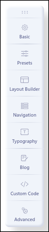
There are 8 options for Style: Basic, Presets, Layout Buider, Navigation, Typography, Blog, Custom Code, and Advanced.
Basic Options
There are 8 options for Basic: LOGO, HEADER, BODY, FOOTER, SOCIAL ICONS, CONTACT INFO, COMING SOON, ERROR PAGE
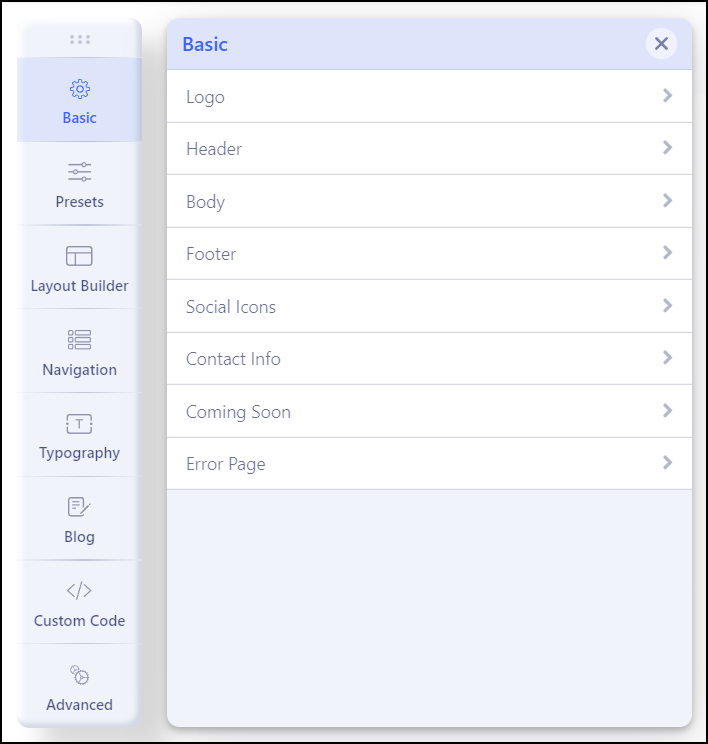
– Logo: The Logo setting provides the ability to easily change the Logo Type, Module Position, Image, Retina Logo and Mobile Logo.
– Header: The Header setting provides the ability to easily change the Sticky Header and Favicon of the header area.
– Body: This feature provides the ability to easily enable boxed layout.
– Footer: The Footer setting provides the ability to easily change Copyright.
– Social Icons: The Social Icons setting provides the ability to easily change Icons and Module Position.
– Contact Information: The Contact Information setting provides the ability to easily change the Information and Module Position.
– Coming Soon: The Coming Soon setting provides the ability to easily change Coming Soon Title and Content.
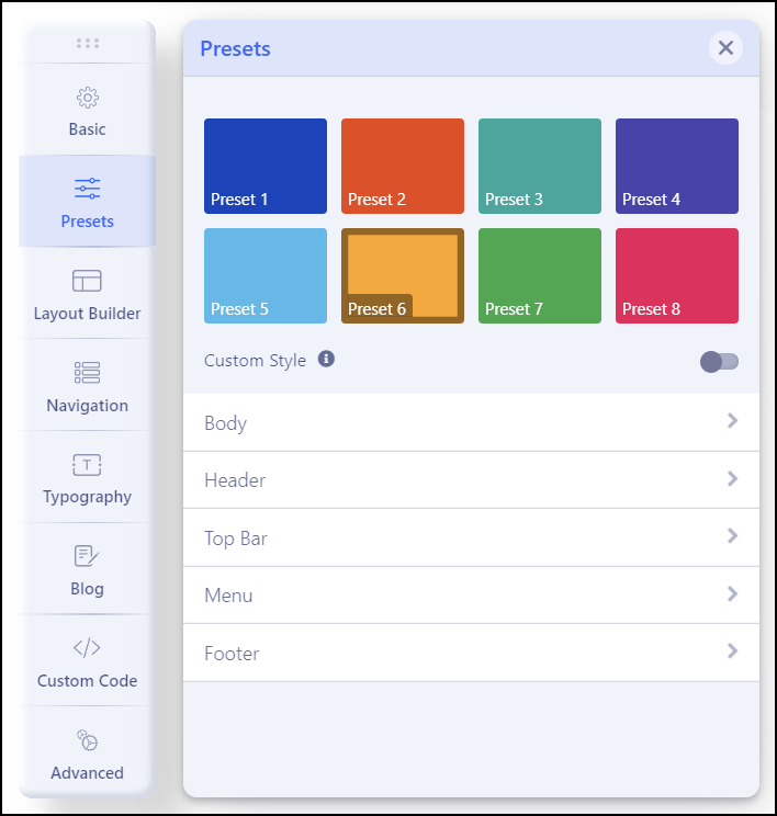
Presets (Color Styles)
The Presets setting provides the ability to easily change Styles and Options.
We defined 8 color presets for the template, you can select an existing color you want and Enable this option to use custom styles. Built-in presets will not work if this option is enabled.
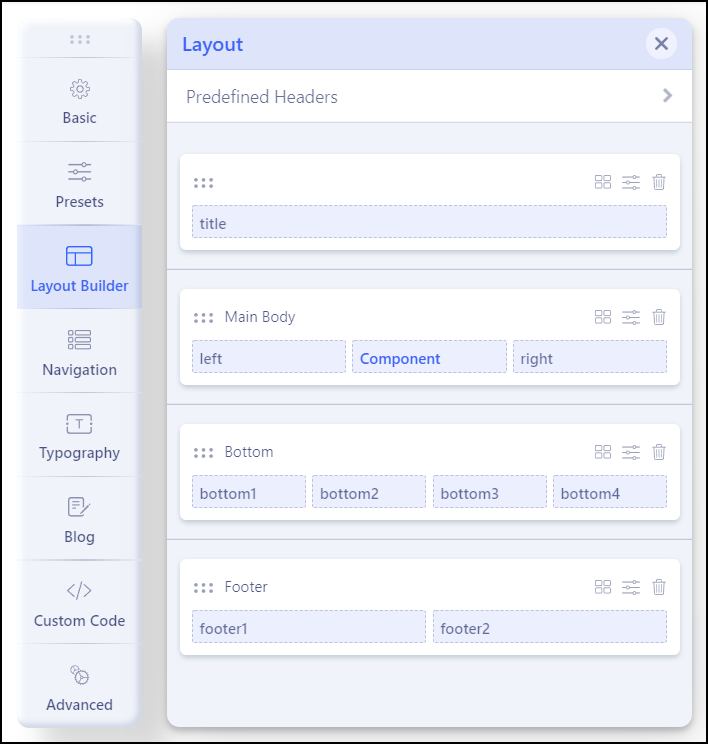
Layout Builder (Template Positions)
The Layout Builder setting provides the ability to easily change the layout template by using: Add Columns, Add Row and Settings.
Navigation (Menu Location & Style)
The Navigation setting provides the ability to easily change Menu, Menu Type, Dropdown Width and Dropdown Animation.
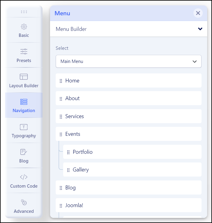
Inside the Navigation/Menu tab, you will find the following tabs:
- Menu Builder – to manage menu structure and menu items content
- Mega Menu – basic settings for Mega Menu display
- Off-canvas – to manage appearance and content of Mobile Menu
Menu Builder
Is an advanced system that allows you to manage menu structure (all menus) with all used items there. By default, it displays MainMenu with all submenu items. Using a mouse you can change the order of menu items, just grab and move up or down. You can also add a new menu item.
- Pen Icon – opens window edit options of chosen Menu Item.
- Basket Icon – allows you to delete chosen menu item.
- Grear Icon – extra settings for chosen menu item (Show Menu Title, Dropdown position, Icon, Custom Class, and Badge).
- Boxes Icon – access to extra settings and Mega Menu options if it would be enabled there. You can add and use badge, icon, and row and column-based menus, also drag and drop the modules to the menu positions from the modules list.
How to build advanced Submenu
If you want to have 2-3-4 columns in the menu as the first step you should start with building menu structure – add submenu items to the main menu item, it’s similar to the root structure. Here is an example of three columns submenu.
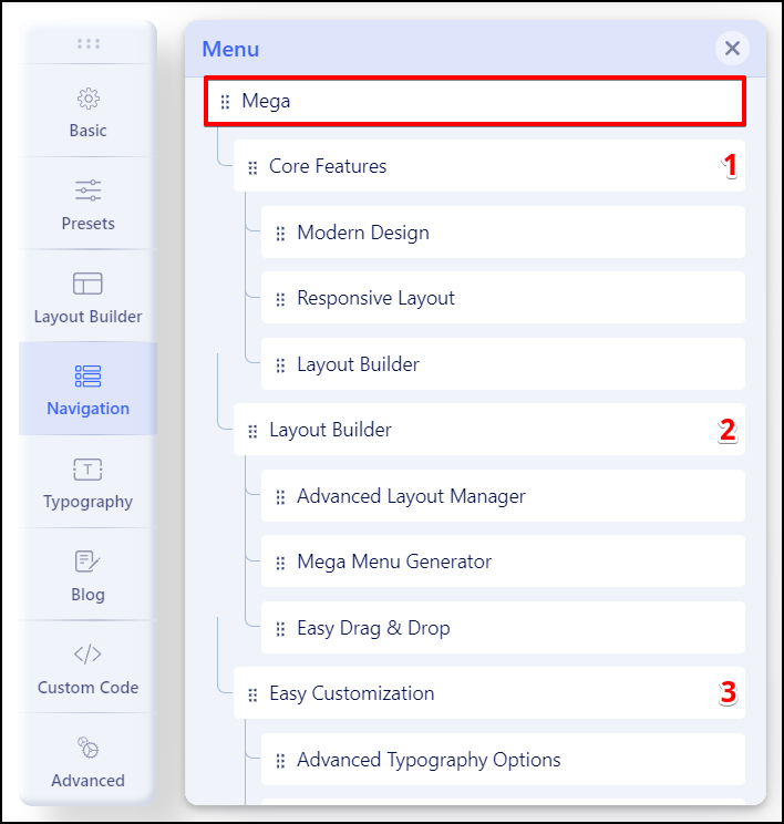
As 2nd step in the first main item please click the “Mega Menu” icon, then enable the “Mega Menu” option. Now you should click the “Add New Row” button. Now you can choose the column structure (it’s based on Boostrap columns grid) – you can use a predefined layout or create your own (Custom).
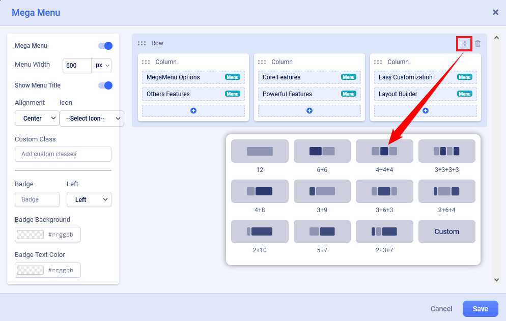
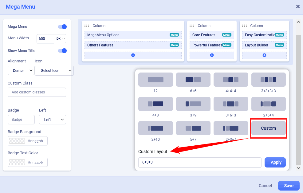
Custom Submenu structure is quite elastic so you can have many different grid layouts – for this purpose we created a “Custom” button. In theory summary of all columns should be equal to 12. For example 6+3+3 or 5+5+2.
Anytime you would be able to delete or redesign layout structure by using icons on the top right position.
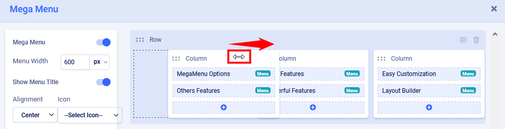
You can also change the order of columns content – hover on the column name until you would see a two-direction arrow icon then you can move the column to the left or ride side, later save settings to see changes.
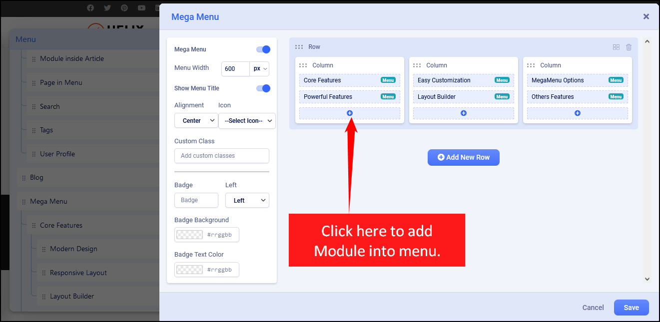
How to add a module inside the submenu
If you enabled Mega Menu and you have a row with a single column or columns you can add now any module from the list of available or installed. For example, you can display a banner, the latest articles, or a login module. Just click the plus (+) icon inside the column where the module should be, then selected a module.
How to add icons in menu items
Using the Mega Menu options allows you to insert an icon next to a menu item and/or use an icon instead of a menu item. As the first step choose an icon from Font Awesome Free 5.15.x collection (around 1600 icons to choose from).
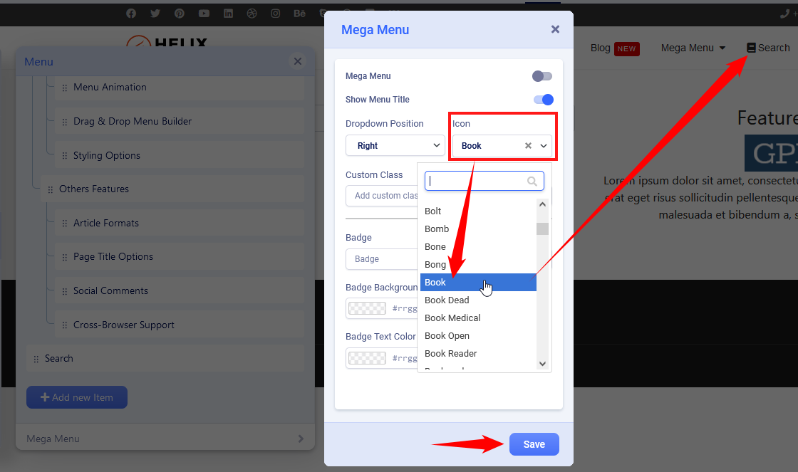
And to have an icon only without a text menu item turn off “Show Menu Title” and then click Save to keep settings.
How to add badges in menu items
The badge is extra information displayed next to a menu item, it’s a helpful feature to highlight a menu item. You can use any word there. Then choose the position of the badge (left, right). Next select background color and text color, if you would not choose any color options, by default dark red with white text would be used.
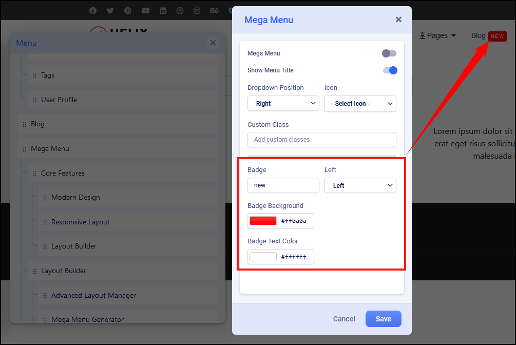
Mega Menu
Menu type – By default, there are enabled two separate menus: Mega Menu and Off-Canvas Menu – sometimes called Hamburger Menu, because of the used shape. In desktop view, you can use both or only MegaMenu. It is pretty easy to disable the Off-Canvas menu from desktop view only. Just select “Mega Menu” and Save settings.
Dropdown Width – Width value is used to declare submenu width content area. By default is 240px. You can choose not only value itself but also different units for expressing width (px, em, rem, %).
Dropdown Animation – Mega Menu offers several transition options for your dropdown submenus:
- No Animation
- Fade In
- Fade In Up
- Fade In Down
- Rotate In
- Zoom In
- Pulse
This is the transition that occurs when the submenu is opened. To have the sub-menu appear with no fancy effect, just set it to None (No Animation).
Off-Canvas / Mobile Menu
Off-Canvas is a mobile menu based on a menu module but customized by the Helix Ultimate framework. It’s used in Mobile and Tablets view mostly. Yes, can be displayed on desktop view as well, in that case, just check Mega Menu tab settings.
Available settings:
- Off-canvas Position – select a position for the off-canvas menu, it can be on the left or right side.
- Select Offcanvas – select premade design for displaying the off-canvas menu (left align, left bordered or center align). Yes, you can create your own design. Just create a new style here: templates\shaper_helixultimate\offcanvas – using one of the existing styles as source code inspiration.
- Select Offcanvas Menu – select which menu should be used for the off-canvas (mobile) menu. Compare to old helix framework versions now by default, you don’t have to publish any menu module to get the mobile menu.
- Maximum Level – select what deep of menu structure should be displayed in the Off-Canvas (Mobile) Menu. If you choose ‘All’, all levels will be shown.
- Enable Search – display the search (classic search in J3.x) field in the off-canvas box.
- Show Contact – display contact information, for example, phone number and e-mail.
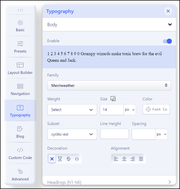
Typography (Font & Size)
The Typography setting provides the ability to easily change Font Family, Font Weight & Style, Font Subset, Font Size and update Google Fonts List.
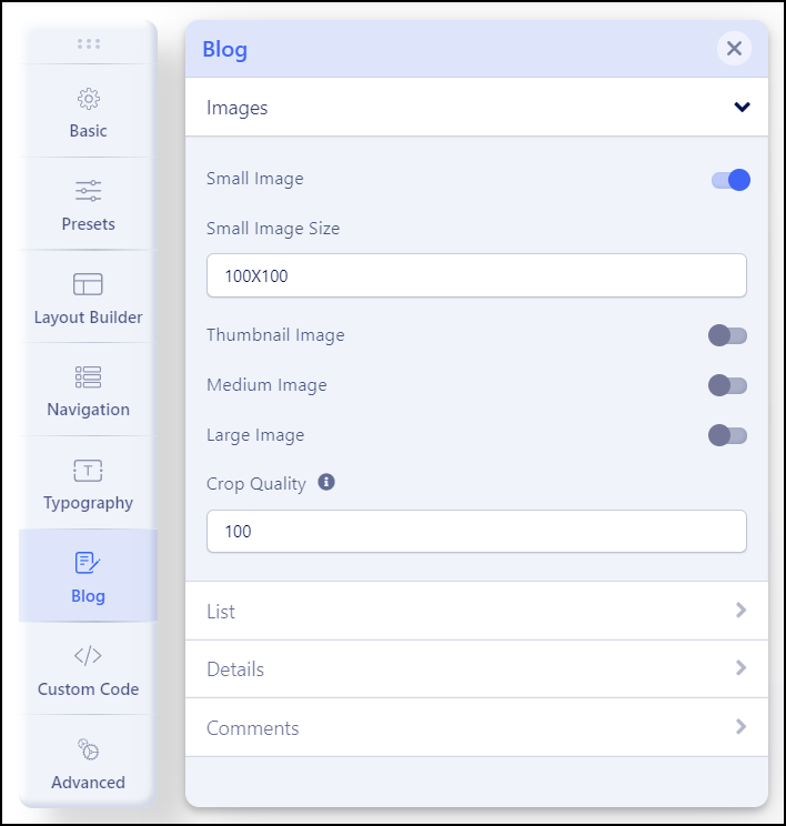
Blog (Joomla! Articles)
The Blog setting provides the ability to easily change settings for Images, List, Details, and Comments.
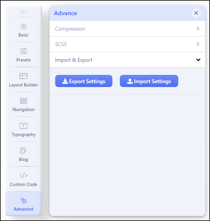
Advanced (Compress / Import & Export Options)
Compression Settings
With these features, you can enable Compress Function for CSS and Javascript files, or Exclude Javascript you want.
Import & Export Options
With this feature, you can import and export template settings. It is also possible to export initial settings such as typography, logo, and importing available settings of the template that you want to install.
Remove / Replace Copyright
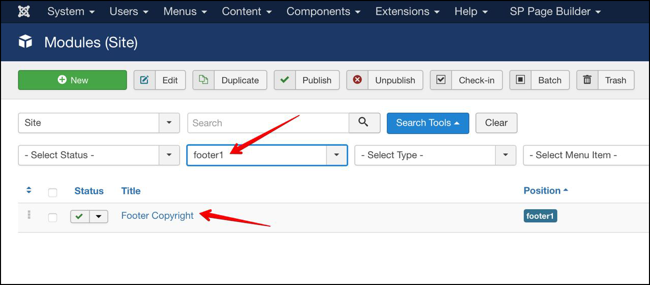
With the PRO version, you can remove the template copyright by navigating to Extensions > Modules, and search for modules at the footer1 position.
Then, click on Footer Copyright to open its edit screen so you can modify it.
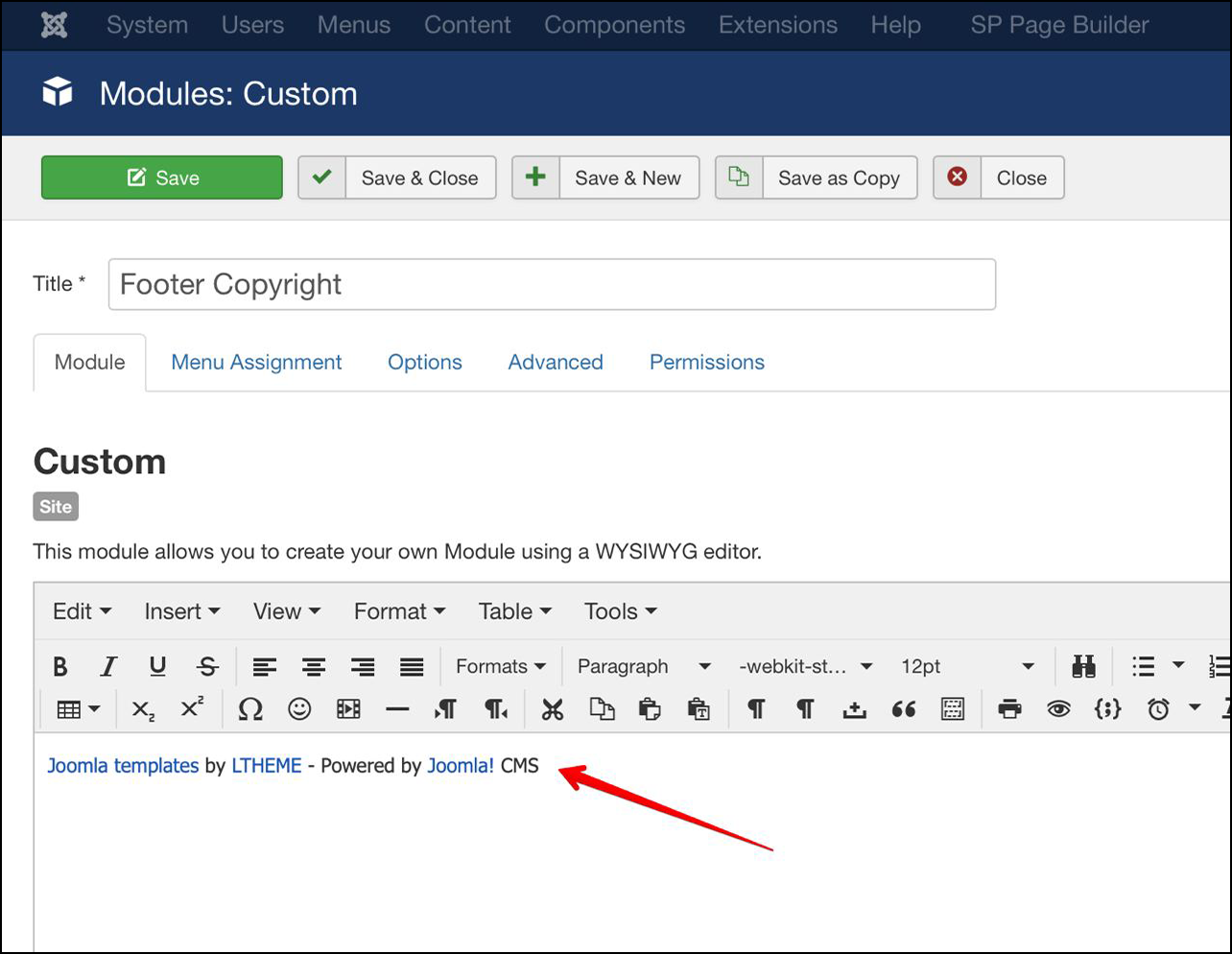
Now, you can replace the default copyright information with your own content. This field supports HTML code, so you can place HTML code such as link with ‘a’ tag or any tags you want, it’s flexible.
Hosting Recommended

If you’re looking for good hosting for your website, recommend you with Ultahost web hosting provider. This hosting is fully compatible with our products. Extremely fast, secure and user-friendly website hosting for your successful online projects, get up to a 20x faster page load times, with unlimited bandwidth and a free cPanel license. Ultahost is recommended hosting from our team for all WordPress themes and Joomla! templates from our company.
Third-party Build-in Document
Template Framework
Extensions Build-in
CSS Libraries
CMS Using
Support system
Ticket System
Still have issue or need assistant with techical problems, feel free submit ticket support via Dedicated Ticket System, our support specialist will come and help you solve all issues shortly.
Install Service
If you want to install Quickstart package on your hosting, you can order here.
Extra Services
Customization Task
If you want to hire our developer to a custom template, you can request here.
Development Service
Looking for new template for your project, and only use it for your website, ask our developer here.