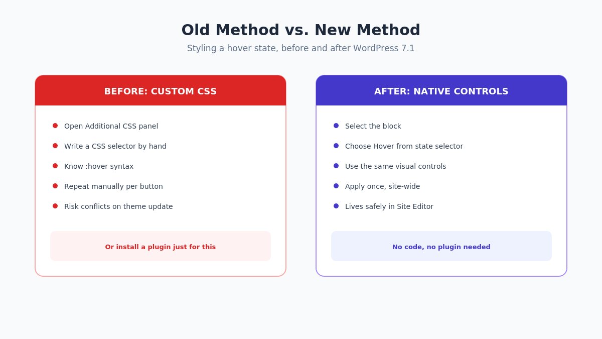
For as long as the block editor has existed, styling a button’s hover state meant one of three things: writing custom CSS in the Additional CSS panel, installing a plugin whose entire job was adding a settings panel for exactly this, or accepting your theme’s default hover behavior and moving on. None of those options were particularly satisfying if you don’t write CSS and don’t want another plugin just to change what happens when someone points their cursor at a button.
It’s a small thing on its own, but it’s been a persistent, low-grade friction point for exactly the kind of site owner who’s otherwise perfectly capable of building and maintaining a good-looking WordPress site without ever touching code. You could get 95% of the way to a professional-feeling site using nothing but the block editor’s native tools — until you hit interactive states, at which point the options narrowed sharply to “learn just enough CSS to write one small snippet” or “install a plugin for a single setting.”
WordPress 7.1, released August 19, 2026, changes that directly. Interactive state styling — hover, focus, and active states — is now built into the block editor interface itself. No custom CSS, no plugin, no theme-specific workaround. This is a practical, hands-on guide to actually using it, along with the design judgment calls that the feature itself won’t make for you.
What Changed, Specifically
The headline addition in WordPress 7.1 is native support for styling a block’s interactive states directly through the editor interface, alongside per-device responsive styling that lets you set different values for mobile, tablet, and desktop without touching a media query. Both features live in the same reorganized Styles tab, which is worth knowing before you go looking for settings that used to live under Layout in earlier versions.
Support for these controls varies by block — buttons have the most complete support at launch, with other interactive blocks catching up over subsequent releases. This guide focuses on buttons specifically, since that’s both the most common use case and the block with the most reliable support right now.
Step 1: Style the Default (Non-Hover) State First
Before touching any hover settings, get your button’s resting state exactly right — background color, text color, border radius, padding, and typography. This matters more than it sounds like it should: a hover effect only reads as intentional and polished when it’s a clear, deliberate change from a well-designed starting point. If the default state is inconsistent or an afterthought, no hover treatment fixes that.
Select your Button block, open the Styles panel, and set your base colors, spacing, and border settings the way you normally would. This is your foundation — everything in the next steps builds a state change relative to it.
Step 2: Access the Hover State Controls
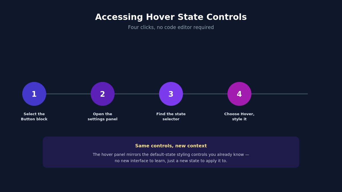
With your Button block selected:
- Open the block’s settings panel (the same sidebar you used to set the default styling).
- Look for the state selector — a small menu or set of tabs that lets you switch between Default, Hover, Focus, and Active states.
- Select Hover. The panel will now show the same styling controls (color, background, border, shadow) but applied specifically to what happens when a cursor is over the button.
- Make your changes. They apply only to the hover state — your default styling from Step 1 remains untouched and reappears the instant the cursor moves away.
The interface deliberately mirrors the default-state styling controls you already know, which is the point — there’s no new mental model to learn, just a new state to apply it to.
Step 3: Don’t Skip the Focus State
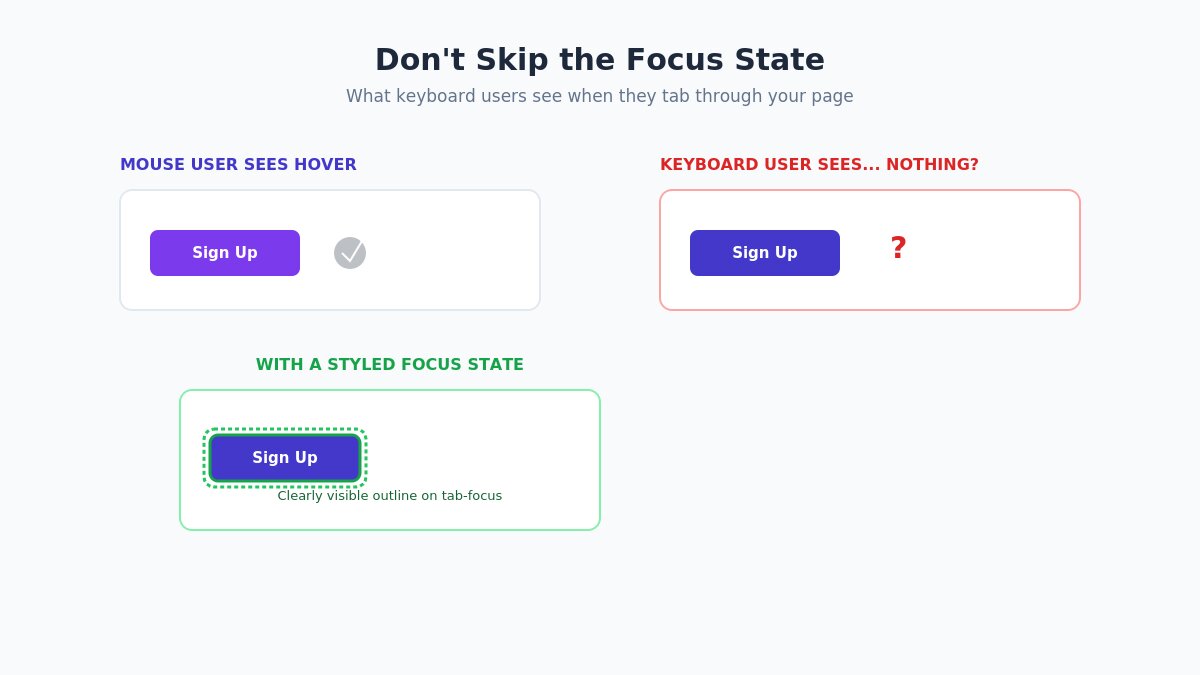
This is the step most people skip, and it’s the one with the most direct accessibility consequence. The focus state is what a keyboard user sees when they tab through your page instead of using a mouse — and if you’ve only styled hover, someone navigating by keyboard gets no visual indication of which button is currently selected at all.
Style the focus state deliberately, not as an afterthought: a visible outline, a border color shift, or a subtle background change all work, as long as it’s clearly perceptible against your button’s default state. A common, reliable pattern is a 2-3px outline in a color that contrasts clearly against both your button and its surrounding background — visible enough to notice at a glance, without needing to study the button closely to spot it.
If you only have time to properly style one non-default state beyond hover, make it this one. Hover only benefits mouse users; focus benefits keyboard users, screen-reader users navigating by tab order, and anyone relying on assistive technology — a meaningfully larger and more consequential audience than “looks nice on hover.”
Step 4: Apply the Style Consistently, Site-Wide
Styling one button is a design decision. Making every button on your site behave consistently is what actually makes a site feel professionally designed rather than assembled page by page. Rather than repeating Steps 1-3 on every individual button block:
- Go to Styles → Blocks → Button in the Site Editor (not an individual post).
- Apply your default, hover, and focus styling here instead.
- Every Button block across your site now inherits this styling automatically, and any individual button can still override it locally if a specific page genuinely needs an exception.
This single step is the difference between “I styled a nice button once” and “my site has a consistent, considered interaction language” — and it takes the same five minutes either way.
Step 5: Set Per-Device Responsive Values Where They Matter
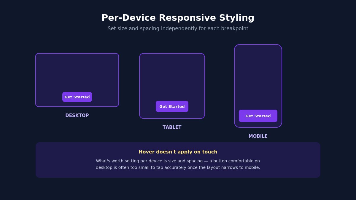
Hover states are mouse-specific by nature — touch devices don’t have a meaningful “hover” the way a cursor does, so don’t spend design effort trying to make an elaborate hover treatment work identically on mobile. What is worth setting per device is size and spacing: a button that’s comfortably sized on desktop is often too small to tap accurately on mobile, and padding that looks balanced on a large screen can feel cramped or oversized once the layout narrows.
To set this: with a Button block selected, look for the device selector (usually represented as small icons for desktop, tablet, and mobile) near the relevant style controls. Adjust padding and font size independently for each breakpoint. This replaces what used to require custom CSS media queries entirely.
Seven Interactive Design Patterns Worth Trying
With the mechanics covered, here are specific, concrete treatments worth testing on your own buttons — all achievable with the native controls, no custom code:
1. Subtle lift with shadow. On hover, add a soft box-shadow and shift the button up by a couple of pixels using a small margin adjustment. Reads as tactile and responsive without being flashy.
2. Color inversion. Swap background and text colors on hover — if your default is a solid brand-color background with white text, hover becomes a white or transparent background with brand-color text and a matching border. Clean, high-contrast, easy to get right.
3. Border reveal. Start with no visible border in the default state, and reveal a colored border on hover. Works particularly well for secondary or “ghost” buttons that shouldn’t visually compete with a primary call-to-action nearby.
4. Gradient shift. If your default button uses a solid color, shift to a subtle two-tone gradient on hover. Effective in small doses — this is one where restraint matters, since an overly saturated gradient shift can feel dated rather than modern.
5. Underline or accent line growth. For text-style buttons or links styled as buttons, animate an underline or accent line that grows from a corner or center point on hover. Understated, works well for secondary navigation actions.
6. Icon slide or reveal. If your button includes an arrow or icon, shift it slightly on hover — a small rightward nudge on a “Learn more →” style button reinforces the forward motion the label already implies, without needing any color change at all.
7. Soft scale. A very slight scale-up (barely perceptible, well under what would feel like a “pop”) on hover can read as a subtle, premium touch on primary call-to-action buttons specifically — used sparingly, and never combined with the lift-and-shadow pattern above, since stacking multiple motion effects is exactly the over-animating mistake covered below.
Whichever pattern you choose, apply the same one consistently across your site rather than mixing several — this is where the Site Editor’s global Button styling from Step 4 pays off directly.
Compatibility: What to Check Before You Rely on This
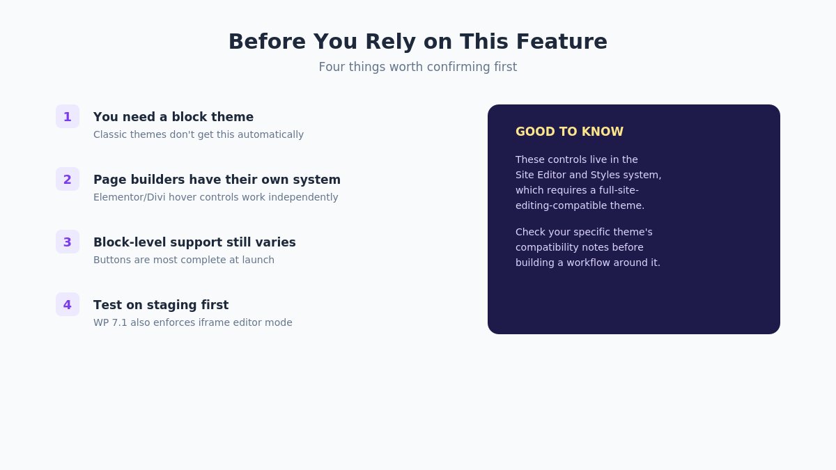
A few things worth confirming before you build your design workflow around this feature:
- You need a block theme. These controls live in the Site Editor and Styles system, which requires a full-site-editing-compatible block theme. Classic themes don’t get this functionality automatically, even after updating to WordPress 7.1.
- Page builders may not use this system. If you’re building pages primarily with Elementor, Divi, or a similar page builder rather than native WordPress blocks, those tools generally have their own separate hover-styling controls that predate this WordPress 7.1 feature and continue to work independently of it — this native system applies specifically to blocks built with the core block editor.
- Block-level support still varies. Buttons have the most complete support at launch. Other blocks are being extended to support interactive states over subsequent releases, so don’t assume every block type has the same controls available yet.
- Test on staging first, particularly if you’re also updating other plugins at the same time — WordPress 7.1 enforces iframe mode for the block editor as part of this release, which is unrelated to hover styling directly but worth knowing about if you notice unrelated editor behavior changes after updating. If you’re managing the update yourself alongside a developer or agency, it’s worth flagging this specifically rather than assuming a routine “update WordPress” ticket covers testing something this new.
Common Mistakes to Avoid
Even with a good, easy-to-use tool, a few mistakes show up consistently once people start experimenting:
- Over-animating. A button that scales, changes color, gains a shadow, and shifts position all at once on hover reads as chaotic rather than polished. Pick one, maybe two changes, and let that be the whole effect.
- Styling hover but ignoring focus. Covered above, but worth repeating: this isn’t optional if you care about accessibility, and increasingly it isn’t optional for compliance either, depending on your region and industry.
- Inconsistent hover behavior across similar buttons. If your primary call-to-action buttons all hover differently from page to page, the site reads as assembled rather than designed, even if each individual button looks fine in isolation.
- Ignoring mobile entirely. Hover doesn’t apply on touch, but tap target size and spacing absolutely still need attention at mobile breakpoints — don’t let “hover doesn’t apply here” become “I didn’t think about mobile at all.”
- Too much contrast change on hover. A hover state that shifts wildly from the default (a light button becoming a jarring dark one, for instance) can feel like a different element entirely rather than a natural state change of the same button.
A Quick Comparison: Old Method vs. New Method
| Before WordPress 7.1 | After WordPress 7.1 | |
|---|---|---|
| Styling a hover state | Additional CSS panel or a plugin | Native state selector in block settings |
| Learning curve | Requires knowing CSS selectors and syntax | Same visual controls you already use for default styling |
| Applying site-wide | Custom CSS targeting every button, or theme editing | One-time setup in Styles → Blocks → Button |
| Responsive adjustments | Manual media queries | Built-in per-device controls |
| Risk of breaking on theme update | Custom CSS can conflict with theme updates | Styles live in the Site Editor, independent of theme code changes |
Extending the Idea Beyond Buttons
While buttons have the most complete support at launch, it’s worth thinking ahead to where this is clearly heading: as more blocks gain interactive state support in future releases, the same approach applies. Links, image blocks, and card-style group blocks are natural next candidates for hover and focus treatment, and the workflow will almost certainly mirror what you’ve just learned for buttons — a state selector, the same familiar styling controls, applied to a new context. Getting comfortable with the pattern now on buttons means you won’t be starting from zero when it expands.
It’s also worth building this into how you evaluate a new theme or a redesign going forward, not just as a one-off exercise on your current button styling. A theme built with this system in mind will expose these controls cleanly through the Site Editor rather than fighting against them with hardcoded hover styles baked into the theme’s own CSS — worth checking directly rather than assuming, since not every theme has been rebuilt with WordPress 7.1’s Styles system fully in mind yet, even if it’s technically compatible.
Choosing Colors for Hover and Focus States
The mechanics of applying a color are trivial once you know where the controls live — the harder question is which colors to actually use, and this is where a lot of otherwise well-executed hover styling falls flat.
Stay within your existing palette. A hover state is not the moment to introduce a brand-new color that doesn’t appear anywhere else on your site. Pull from colors already in your brand palette — a darker or lighter shade of your primary color, your existing accent color, or a neutral from your palette used more prominently. This keeps the change feeling like a natural extension of the button rather than an unrelated color swap.
Make the contrast change deliberate, not accidental. If your default button uses a mid-tone color, decide intentionally whether hover should feel lighter (airier, more approachable) or darker (more grounded, more serious) — both are valid design choices, but pick one direction and apply it consistently rather than letting individual buttons drift in different directions across your site.
Check contrast ratios for the focus state specifically. Since focus styling exists primarily for accessibility, this is the one state where meeting WCAG contrast guidelines isn’t optional if you want the feature to actually serve the people who rely on it. A focus outline in a color too close to your background or button color technically exists but doesn’t functionally help anyone trying to see it. Most accessible-color-checker tools (many are free and browser-based) can confirm your specific combination passes before you commit to it site-wide.
Consider what the color communicates, not just how it looks. A hover state that shifts toward red on a “Delete” or “Cancel” button reinforces the action’s meaning. The same red shift on a “Submit” or “Continue” button sends a confusing signal, regardless of how visually appealing the color itself is in isolation. This is a small detail, but it’s the kind of thing that separates a button that merely looks good from one that actually communicates correctly at the exact moment a visitor is deciding whether to click it.
Testing Across Browsers and Devices
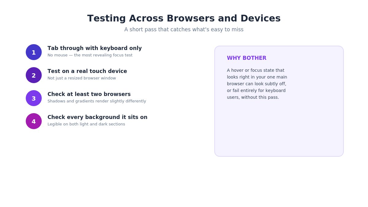
Once your styling is in place, a short testing pass catches the issues that are easy to miss when you’re the one who just built it:
- Tab through your own page using only the keyboard, no mouse. This is the single most revealing test for focus styling — if you can’t tell which element is focused at any point without looking closely, your visitors relying on keyboard navigation can’t either.
- Test on an actual touch device, not just a browser resized to look like one. Some browsers simulate a brief “hover” state on tap before registering a click, which can create a flash of the hover styling on mobile that looks unintentional if you haven’t accounted for it.
- Check your hover and focus styling in at least two browsers. Rendering of shadows, gradients, and transitions can vary slightly between browser engines, and a subtle difference that’s invisible in your primary development browser can look noticeably off in another.
- Confirm the change is visible against every background your button appears on. A button that sits on both light and dark section backgrounds across different pages needs hover and focus styling that works legibly against both, not just the background you happened to be testing on when you designed it.
Where This Fits in Your Design Process
The realistic way to use this feature isn’t as a one-time button styling exercise — it’s as a small addition to how you already approach a new page or section. Style your default button state as part of your normal layout work, then spend the extra two minutes setting hover and focus states through the Site Editor’s global Button styles once, and every button across the site inherits it from that point forward.
The genuine shift here isn’t that hover effects are newly possible in WordPress — they always were, with enough CSS. It’s that they’re now accessible to anyone who can already use the block editor, without needing to write or maintain custom code, which means considered interactive states stop being something only sites with developer support get to have.
Want a theme built to take full advantage of native block editor styling like this? Browse our WordPress themes.

Thank you for being here!
- Overcoming the Core Challenges of Legacy Application Modernization – September 25, 2026
- Why Your Website Fonts Flash or Disappear on Load: FOUT vs FOIT Explained – August 30, 2026
- WordPress 7.1 hover and focus styling design guide – August 22, 2026