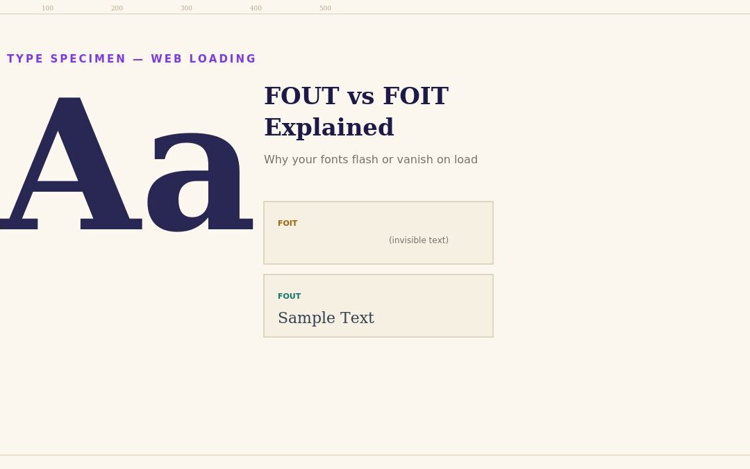
You load your site and for a split second, the heading is invisible, or it’s briefly rendered in a generic system font before snapping into your actual custom typeface. Neither is a bug — both are the browser making a deliberate choice about what to do while your custom web font is still downloading, and which choice you get depends on a setting most site owners have never touched. Here’s what’s actually happening, what the two default behaviors are, and how to control it properly instead of leaving it to chance.
This is also a genuinely underrated topic for anyone who’s spent real time and money selecting the right typography for their brand. A carefully chosen font pairing communicates something specific about a business — elegant, playful, technical, trustworthy — and that entire investment is briefly undermined every single page load if visitors see a jarring flash or a moment of missing content before the actual typography appears. Getting font loading right isn’t just a technical nicety; it’s the difference between your typography choice actually landing as intended versus being quietly compromised by an unmanaged loading behavior nobody deliberately chose.
Why This Happens at All
Why web fonts load separately from page content
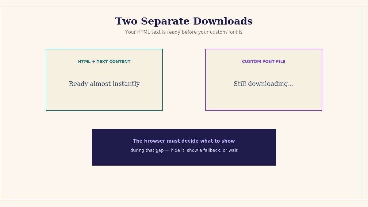
A custom web font — whether from Google Fonts, Adobe Fonts, or a font file you’re self-hosting — is a separate file the browser has to download, distinct from your page’s HTML and CSS. Your page’s text content is ready to display immediately, but the specific typeface it’s supposed to render in might not have finished downloading yet, especially on a slower connection or when the font file is large.
The browser has to decide what to do during that gap. It could show the text immediately in a fallback font and swap to your custom font once it arrives. It could hide the text entirely until the custom font is ready. Or it could do something in between. This decision has a name, a specific set of standardized behaviors, and — critically — a CSS property that lets you choose deliberately rather than accepting whatever the browser defaults to.
FOIT: Flash of Invisible Text
Flash of Invisible Text (FOIT) explained
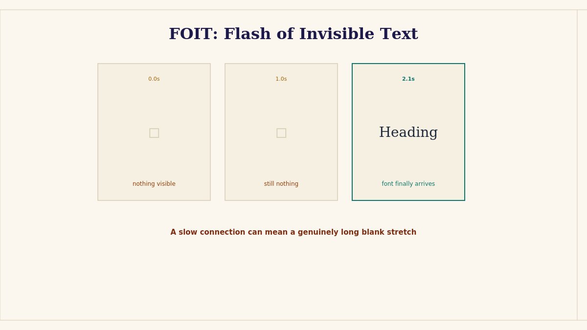
FOIT is what happens when the browser hides text completely until the custom font finishes downloading. For years, this was the default behavior in most browsers, and it’s exactly the “why did my heading just vanish for a second” experience.
The reasoning behind this default isn’t arbitrary — it prioritizes visual consistency (never showing text in the “wrong” font, even briefly) over showing content as fast as possible. In practice, though, this trade-off tends to work against user experience more than it helps: a visitor on a slow connection can end up staring at a blank space where a heading or paragraph should be, for a genuinely noticeable stretch of time, purely because the browser is waiting for a font file rather than showing them something to read immediately.
FOUT: Flash of Unstyled Text
Flash of Unstyled Text (FOUT) explained
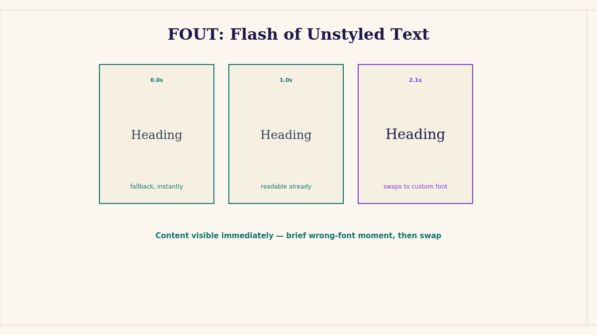
FOUT is the opposite approach: the browser shows text immediately in a fallback font — typically the closest system font available — and swaps it to your intended custom font the moment it finishes downloading. This means visitors see content right away, but they briefly see it in the wrong typeface, and depending on how different your fallback and custom fonts are in size and spacing, this swap can cause a visible layout shift as text reflows into its final font.
Most current browsers and modern font-loading strategies favor some version of FOUT over FOIT, on the reasoning that showing readable content immediately, even briefly in the wrong font, serves visitors better than an invisible page. This is also directly why Google’s Core Web Vitals and general page-speed guidance increasingly steer developers toward FOUT-style loading — a blank, invisible heading actively hurts real, measured page-experience metrics.
The Actual Control: font-display
The CSS font-display property explained
This is the part most site owners never learn about, because it’s usually buried in a @font-face declaration rather than somewhere obviously visible in a theme’s settings panel. The CSS font-display property lets you explicitly choose the loading behavior, rather than accepting whatever a given browser defaults to:
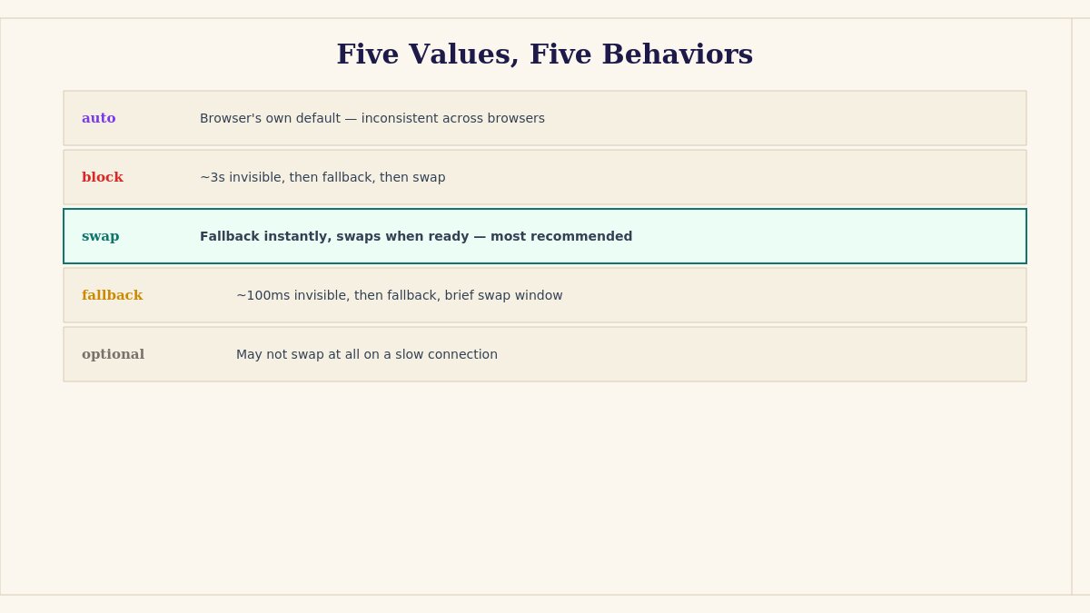
auto — the browser’s own default behavior, which varies by browser and has historically leaned toward FOIT-style blocking in many cases.
block — a short invisible period (typically around 3 seconds) where FOIT applies, followed by a fallback font showing if the custom font still hasn’t loaded, then swapping once it does.
swap — text renders immediately in a fallback font, swapping to the custom font whenever it finishes loading, essentially no invisible period at all. This is the most common recommendation for prioritizing readability and perceived speed.
fallback — a very brief invisible period (around 100ms), followed by fallback text, with a limited window (a few seconds) during which the custom font can still swap in — after that window, the browser gives up and keeps the fallback font for that page load.
optional — similar to fallback but even less committed to eventually loading the custom font at all, particularly on a slow connection — the browser may simply decide not to bother swapping if conditions aren’t good, prioritizing speed over ever showing the intended font that specific visit.
Setting this explicitly, rather than leaving it to auto, is the actual fix for both FOIT and uncontrolled FOUT — it’s the difference between the browser making an assumption on your behalf and you making a deliberate choice appropriate to your specific site and audience.
Choosing the Right Value for Your Situation
Choosing the right font-display value for your website
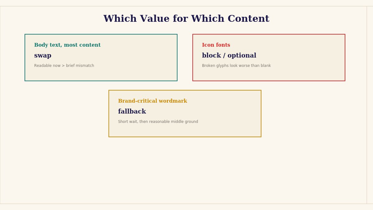
For body text and most content, swap is the generally recommended default — readable content immediately outweighs a brief, usually minor visual font mismatch, especially since most fallback and custom font pairings aren’t dramatically different in size.
For decorative or icon fonts where the fallback would look genuinely broken or nonsensical (icon fonts rendering as random characters, for instance) rather than just visually different, block or optional may be more appropriate, since a brief invisible period is preferable to visibly broken-looking icons.
For a brand where exact typography consistency matters intensely in specific contexts (a logo-adjacent wordmark, for instance), fallback offers a middle ground — a short invisible window, then a reasonable fallback, without leaving the page blank indefinitely if the font is slow to arrive.
If page speed and Core Web Vitals scores are a specific priority, swap combined with proper font preloading (covered next) is generally the strongest combination available.
Browser Behavior Isn’t Perfectly Uniform
It’s worth knowing that font-display values are a W3C standard, but the exact timing details (like the precise length of the “block” period) have historically varied slightly between browser engines, and browser defaults for auto have also shifted over time as browsers have generally trended toward favoring FOUT-style behavior by default in recent years. This means two things practically: first, setting font-display explicitly is more reliable than trusting auto to behave consistently across every browser your visitors use. Second, if you’re troubleshooting a font-loading issue, it’s worth testing in more than one browser before concluding you’ve found the actual cause — a behavior that looks like a bug in one browser might simply be that browser’s particular timing for a font-display value working as intended.
This is also why testing on your own primary development browser alone can be misleading — if you build and test exclusively in one browser, you may never notice a font-loading experience that looks meaningfully worse in a browser you don’t personally use day to day, even though a real share of your visitors do.
Variable Fonts and Loading Behavior
How variable fonts affect font loading behavior
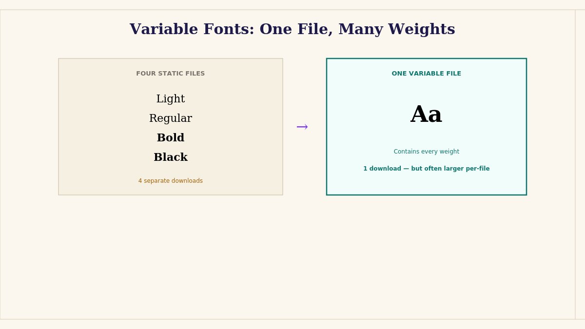
Worth a specific mention if your theme uses variable fonts — a newer font technology where a single font file contains multiple weights and styles (regular, bold, italic, and everything between) rather than requiring a separate file download for each variation. Variable fonts genuinely help with the loading problem covered throughout this guide, since loading one variable font file instead of four or five separate weight-specific files means fewer total font requests and less total data to download before your typography is fully ready.
The trade-off is that a single variable font file is often larger than any one individual static weight file, so the actual performance comparison depends on how many weights and styles your specific design actually uses — a design using just two weights (regular and bold) might load faster with two small static files than with one larger variable font file containing weights you don’t even use. A design using four or five different weights, by contrast, often comes out ahead with a single variable font file instead of that many separate downloads. Worth testing your specific font choice and actual usage pattern rather than assuming variable fonts are automatically the faster option in every case — they’re a genuine tool for this problem, not an automatic win regardless of how they’re used.
Beyond font-display itself, two additional techniques reduce how jarring a FOUT-style swap actually looks:
Preloading your critical fonts — adding a <link rel="preload"> tag for your most important font files in your page’s <head> — tells the browser to prioritize fetching that specific file earlier than it otherwise would, shortening the window during which the fallback font is showing at all.
Choosing a fallback font with similar metrics to your custom font (similar character width and height) minimizes the visible reflow when the swap happens — some font pairing tools and modern CSS techniques can calculate a close-matching fallback automatically, worth researching if layout shift during font swap is a specific, measurable problem on your site.
Setting This Up on WordPress and Joomla
Setting up font-display on WordPress and Joomla
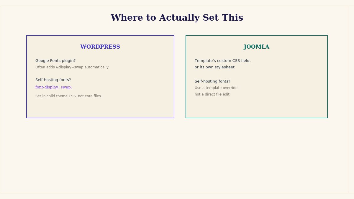
On WordPress, how you control this depends on how your fonts are loaded. If you’re using Google Fonts via a plugin or a theme’s built-in font loader, many modern tools already append &display=swap to the Google Fonts URL automatically — worth checking your theme’s font-loading code or plugin settings to confirm. If you’re self-hosting font files directly (increasingly common for performance and privacy reasons, since it avoids an external request to Google’s servers entirely), you control this directly in your @font-face CSS rule, ideally added through a child theme rather than a direct theme file edit — see our theme customization guide if you need a refresher on doing this safely.
On Joomla, font loading is typically controlled by the template itself, either through a template-level custom CSS field or directly in the template’s stylesheet. Check your specific template’s documentation for how it loads fonts, since implementation varies meaningfully by template, and a self-hosted or overridden font declaration should go through a proper template override rather than a direct file edit, for the same update-safety reasons that apply to any other template customization.
Self-Hosting Fonts vs. Google Fonts CDN
Self-hosting fonts versus using Google Fonts CDN
This decision interacts directly with font-loading behavior, and it’s worth understanding the trade-off rather than assuming one approach is universally correct.
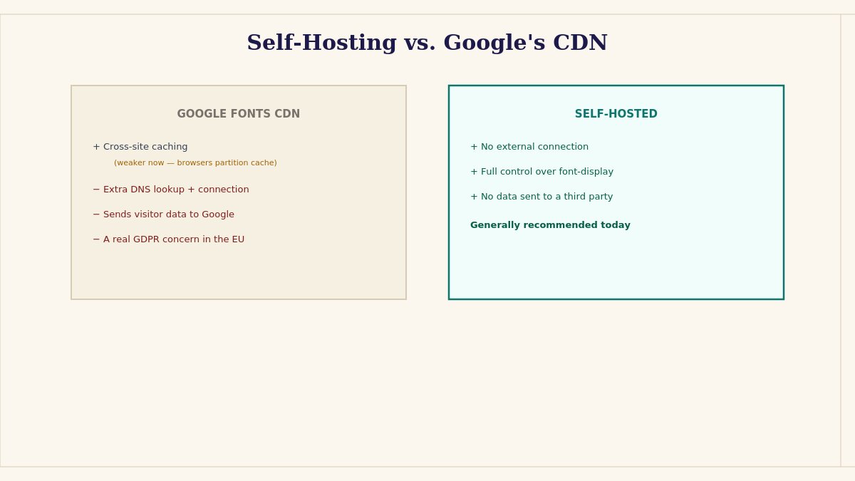
Loading fonts from Google’s CDN (the traditional approach, where your site’s CSS references a font file hosted on Google’s servers rather than your own) has one genuine advantage: if a visitor has already loaded that specific font from Google’s CDN on a different site recently, their browser may have it cached already, skipping the download entirely for your site too. In practice, this cross-site caching benefit has diminished significantly in recent years, since most modern browsers now partition cache storage per-site specifically to prevent this exact kind of cross-site tracking — meaning the caching advantage that used to be the strongest argument for Google’s CDN is considerably weaker than it once was.
Self-hosting your font files directly — downloading the font files and serving them from your own domain rather than an external one — has become the more commonly recommended approach for a few concrete reasons: it eliminates a separate DNS lookup and connection to an external domain (fonts.googleapis.com or fonts.gstatic.com), which itself adds measurable time before the font can even begin downloading; it gives you direct, full control over the exact font-display value and other loading behavior without depending on how a plugin or theme constructs the external request; and it avoids sending visitor data (IP address, browser details) to Google’s servers purely to fetch a font file, which matters specifically for GDPR compliance in the EU, where several regulatory rulings have flagged unconsented Google Fonts CDN loading as a genuine compliance concern for sites with European visitors.
The practical recommendation for most sites today: self-host your font files where reasonably feasible, both for the performance benefit of eliminating the external connection and for the privacy and compliance benefit if you have any European visitors at all. Many WordPress plugins and Joomla extensions now handle this automatically — downloading Google Fonts files and serving them from your own domain rather than Google’s — worth checking whether your specific theme or a dedicated font-hosting plugin already does this before assuming you need to handle the file management manually.
Measuring Whether This Is Actually a Problem on Your Site
Before spending significant time optimizing font loading, it’s worth confirming this is actually a meaningful problem on your specific site rather than a theoretical concern. A few ways to check directly:
Browser DevTools’ Network tab shows exactly how long each font file takes to download on your current connection, and the Performance tab can show you a visual timeline of when text becomes visible relative to when fonts finish loading — this turns “I think there might be a flash” into a specific, measured number.
Google’s PageSpeed Insights or Lighthouse flag font-loading issues directly if they’re contributing meaningfully to your Cumulative Layout Shift score or your Largest Contentful Paint timing — two Core Web Vitals metrics that Google’s own search ranking systems take into account, giving font loading a real, measurable SEO dimension beyond just the visual experience.
Testing on an actual throttled connection (DevTools has a built-in network throttling feature simulating slower mobile connections) reveals problems that are essentially invisible on a fast office or home internet connection but very real for a meaningful share of actual visitors, particularly on mobile.
If your fonts are small, load quickly, and your Lighthouse scores don’t flag layout shift or paint timing issues, this may genuinely not be a significant problem for your specific site, and the effort is better spent elsewhere — this guide is most valuable for sites with larger font files, multiple font weights, or measurably slow-loading typography, not as a mandatory checklist for every site regardless of actual measured impact.
Open your site and watch the initial load carefully — is text invisible briefly (FOIT), or does it flash from one font to another (FOUT)? This tells you your current default behavior.
Check your @font-face declarations (via browser DevTools or your theme’s font-loading code) for whether font-display is set explicitly or left at auto.
Set it explicitly — swap for most body content, considering block or fallback specifically for decorative or icon fonts where a mismatched fallback would look broken rather than just different.
Test on a throttled connection in DevTools, since font-loading behavior is far more noticeable on slower connections than on your own fast development environment.
Consider preloading your most critical font file if the swap is still visually jarring even with font-display: swap set correctly.
If this is happening on a site built with one of our templates and you’re not sure where the font-loading code actually lives, our ticket support team can help trace it down, and our customization service can implement a proper fix if you’d rather not handle the CSS directly yourself.
The One Property Worth Setting Deliberately
Of everything covered here, the single highest-leverage change is simply this: find your @font-face declarations and set font-display: swap explicitly, rather than leaving it at the browser’s default. That one line addresses the invisible-text problem directly, gets content in front of visitors immediately, and turns an accidental, browser-decided behavior into a deliberate choice that matches how you actually want your site to feel while it loads.
Everything else in this guide — preloading, font matching, self-hosting, variable fonts — is genuinely worth doing for a site where font loading measurably matters, but none of it replaces this one line as the actual foundation. Set it explicitly first, measure whether anything still feels off, and only then decide whether the more involved optimizations are worth your time for your specific site’s specific situation.
Starting from a theme built with sensible font-loading defaults already in place? Browse our WordPress themes or Joomla templates.
My name is Kelvin, and I’m the Chief Marketing Officer at LTheme. I have over 10 years of experience in Joomla! and WordPress web development, as well as in digital marketing, where I specialize in SEO. Every day, I write blogs about Joomla! and WordPress, assist others in creating beautiful websites using these CMS platforms, and provide support on the Joomla Support Board as a Joomla Guru in the forum. Thank you for being here!
We use cookies to improve your experience on our website. By browsing this website, you agree to our use of cookies.
Functional
Always active
The technical storage or access is strictly necessary for the legitimate purpose of enabling the use of a specific service explicitly requested by the subscriber or user, or for the sole purpose of carrying out the transmission of a communication over an electronic communications network.
Preferences
The technical storage or access is necessary for the legitimate purpose of storing preferences that are not requested by the subscriber or user.
Statistics
The technical storage or access that is used exclusively for statistical purposes.The technical storage or access that is used exclusively for anonymous statistical purposes. Without a subpoena, voluntary compliance on the part of your Internet Service Provider, or additional records from a third party, information stored or retrieved for this purpose alone cannot usually be used to identify you.
Marketing
The technical storage or access is required to create user profiles to send advertising, or to track the user on a website or across several websites for similar marketing purposes.









Recent Comments