Layout Builder is a unique feature of Helix Ultimate which allows you to customize your existing Joomla template and build flexible layout on module positions without code customization.
1. Layout Grid
Helix Ultimate includes a powerful mobile-first flexbox grid system for building layouts of all shapes and sizes. It allows you to choose column pre-set or set your own grid. The grid system is fully responsive, so the columns will display well on any screen size.
- As the screenshot below, Helix Ultimate has been added 2 built-in header variations, that will enrich the scope and versatility of your sites. However you can also create your own custom header variation.
Each Row has its own column structure and settings. - Where there are arrow icons, you can change the position of the row.
- When you want to add new row, just click the plus icon (+), then choose column structure and select module position(s). You should insert ID name for the new Row.
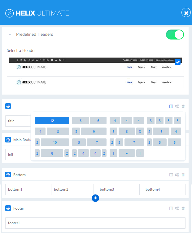
Image by Joomshaper
Step by step guide to create custom header:
Watch the video tutorial below:
- To create custom, first, you turn off the Predefined Headers option.
- Click on (+) icon to create new row.
- Grab new row and move up above the “Page Title” row.
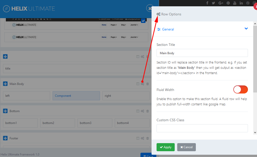
- Click gears icon to get into row options.
- Add name: header inside the “Section Title” field.
- To set column layout, you click columns icon.
- Now you can set your own custom header or select one from predefined.
- Less area reserved for logo column – means that presented logo would be smaller.
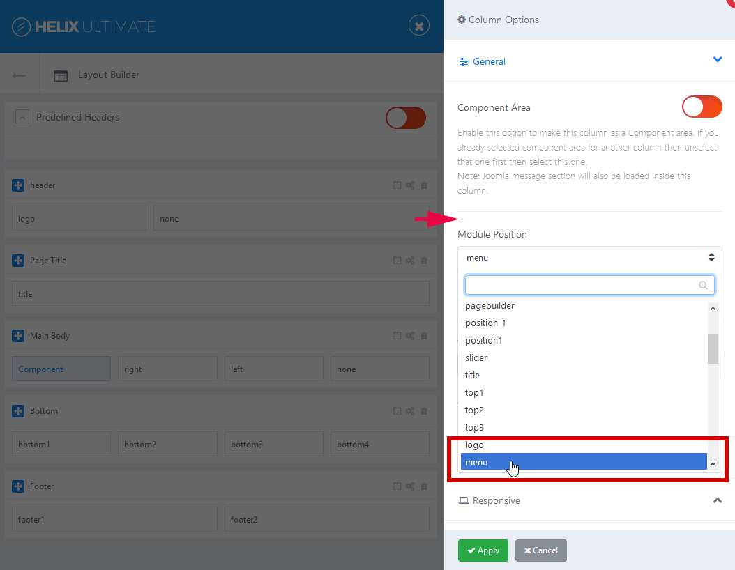
- In “Module position” option, you choose module position for each column.
- Save changes.
- Now you can set responsive grid for each column
- Each responsive breakpoint has a grid breakpoint.
Note:
– Logo would be taken from Helix Basic settings, Menu would be taken from Helix Mega Menu engine.
– If you want to use your own menu module , you have to choose different module position name, do not use “menu“.
2. Row Options
What can you do in Row Options?
- Insert section title ( you should choose short title and have no languge native marks)
- You can set Fluid Width
- Add Custom CSS Class Name
- It also allows you to define Row Style: margin, text color, padding, link color, link hover color, background color and background image.
- Hide Row on selected devices, related with screen resolution: Smartphone (screen width less than 576px), Largen Smartphone (screen width equal to or greater than 576px), Tablet (screen width equal to or greater than 768px), Smaller Desktop ( screen width equal to or greater than 992px), Desktop (screen width equal to or greater than 1200px).
3. Columns Options
- Enable “Make Compnent Area” option to make this column as a Component area. Joomla message section will also be loaded inside this column. Only one column in whole layout can be used for showing component.
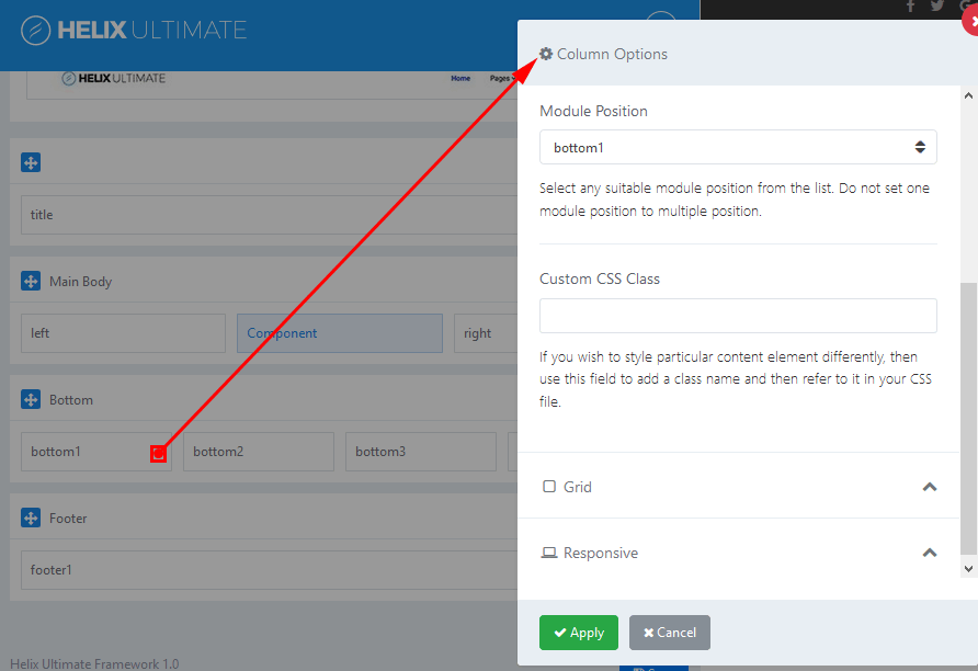
- Module Position: Choose a suitable module position from the list. Note: Do not set this same module position to multiple position. Here is the list of all available module positions:
° title
° top1
° top2
° top3
° logo
° menu
° search
° slide
° user1
° user2
° user3
° user4
° left
° right
° feature
° slider
° position1
° position2
° position3
° position4
° position5
° position6
° position7
° position8
° content-top
° content-bottom
° bottom1
° bottom2
° bottom3
° bottom4
° breadcrumb
° footer1
° footer2
° comingsoon
° offcanvas
° pagebuilder
° 404
° debug
Above and below component area there are two module positions: content-top and content-bottom which you can use to publish any module.
- Custom CSS Class – add a class name if you wish to style particular content element differently
- Grid – this option allows you to control of responsive layout. There are five grid breakpoints, one for each responsive breakpoint.
- Responsive option: you can control of visibility of columns. Hide columns on selected devices, related with screen resolution: Smartphone (screen width less than 576px), Largen Smartphone (screen width equal to or greater than 576px), Tablet (screen width equal to or greater than 768px), Smaller Desktop (screen width equal to or greater than 992px), Desktop (screen width equal to or greater than 1200px).
If you have any question about this tutorial, don’t hesitate to leave a comment below. And don’t forget to share with your friends if you find it useful! Thanks! ?

- Resolving the “Class JFactory Not Found” Error in Joomla When Upgrading to J6 - December 19, 2025
- The Utility Of VPNs For Site Authors And Admins - November 24, 2025
- Joomla! 6: What’s New and How to Upgrade from Joomla! 5 - October 23, 2025


Very powerful. Yet I’m missing one option: If I set the column layout to 3+3+3+3 the framework will set the class of the 4 columns to “col-lg-3”. What if I want “col-sm-6 col-lg-3”?
This code generated by bootstrap automatically, and from framework, you can’t modify it.
Hi how did make my blog to have 3 columns like helix framework
Yes, you can put normal articles listing from Component, then you can put modules at position ‘left’ and ‘right’. So, you will have three col blog.